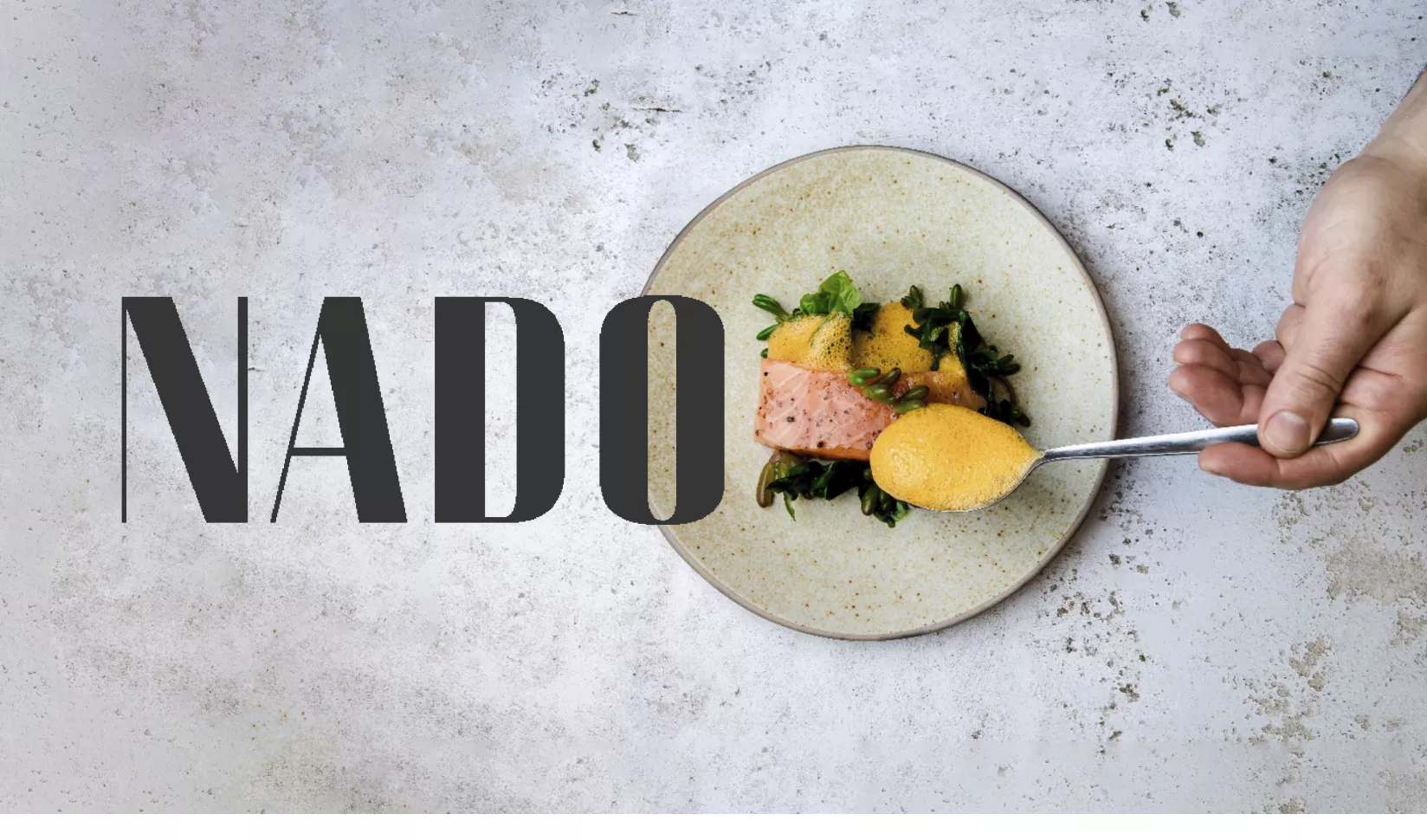
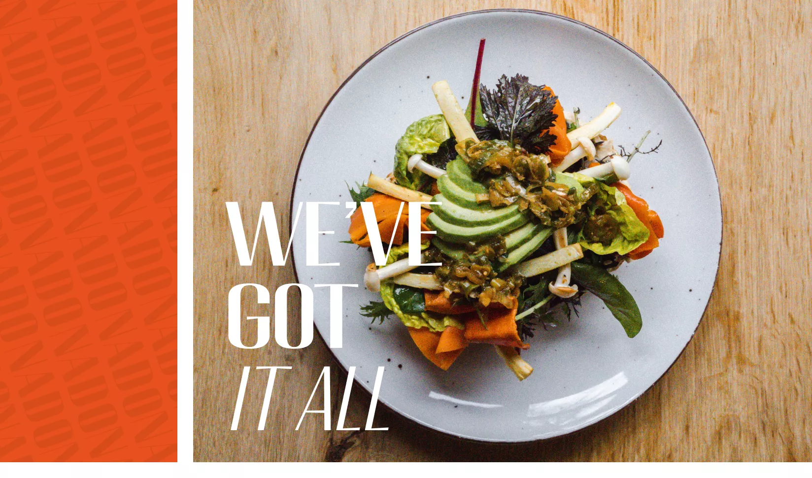
A name is personal. But it also needs to tick a few boxes: recognisable, easy to pronounce, and in this case, modern with a cosmopolitan flair. During the brainstorm, we explored several directions. Should the name reference the central location – right opposite Eindhoven Centraal train station? Should it hint at the surprising items on the menu? Or could we draw inspiration from the founders' names: Shelina and Guido? The result: NADO – from SheliNA and GuiDO.
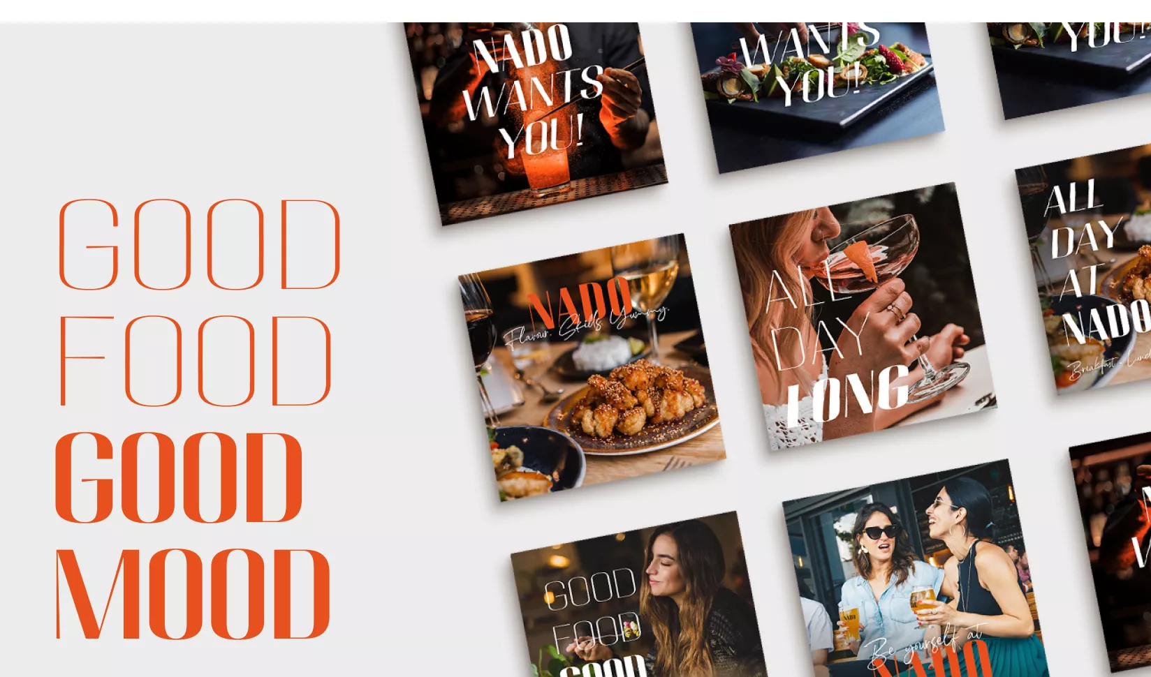
So how do you give a great story the look it deserves? With the right brand assets: logo, typography, colour palette, photography, and surprising stylistic elements. Redkiwi’s Head of Creativity, Steven Olde Hengel, knew exactly where to start, working from five key themes: Cosmopolitan, Cheerful, Energetic, Positive and Active.
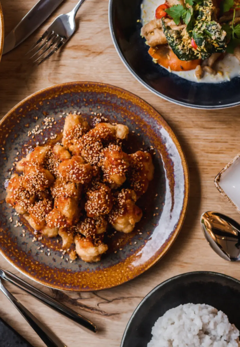
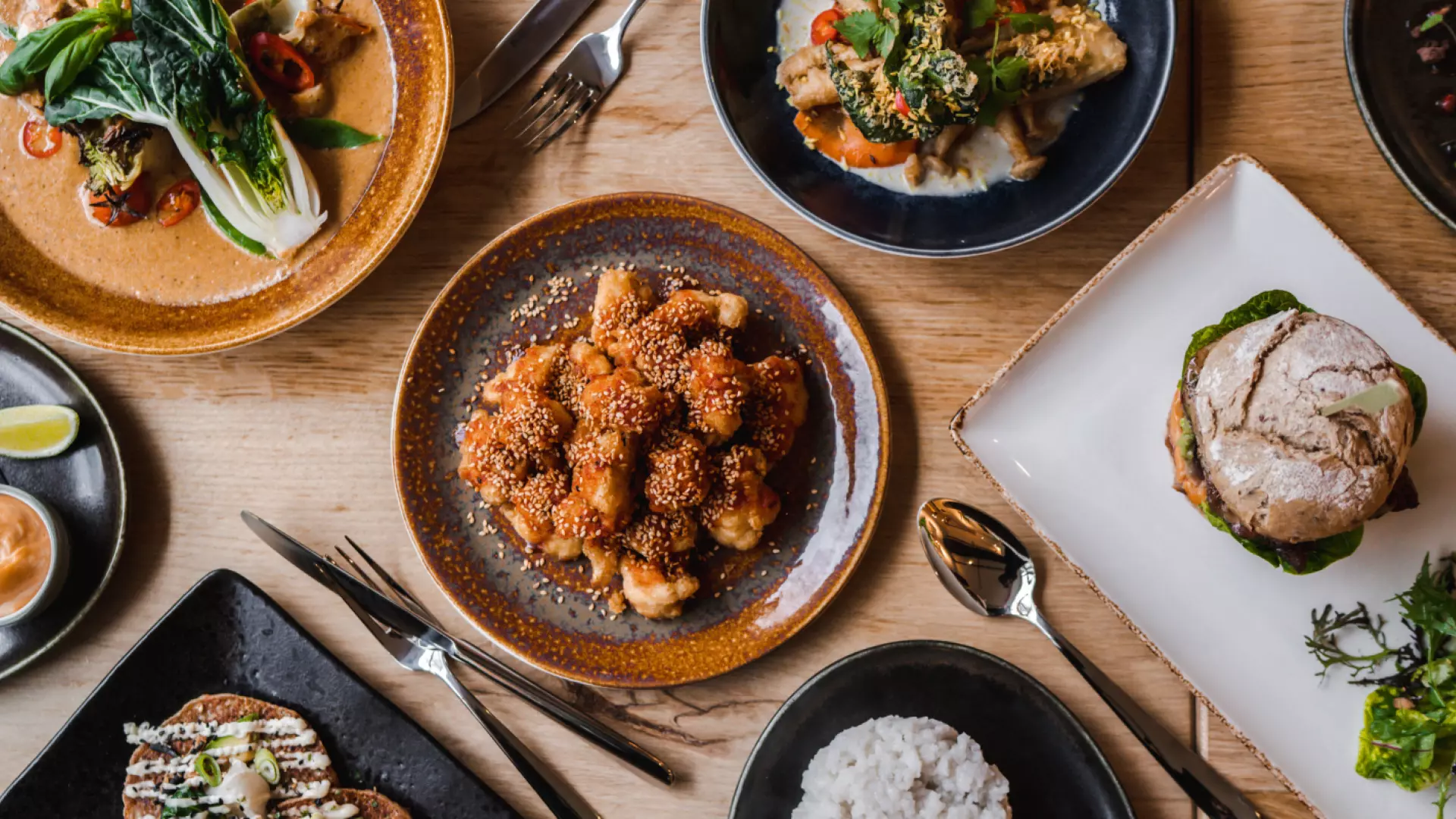
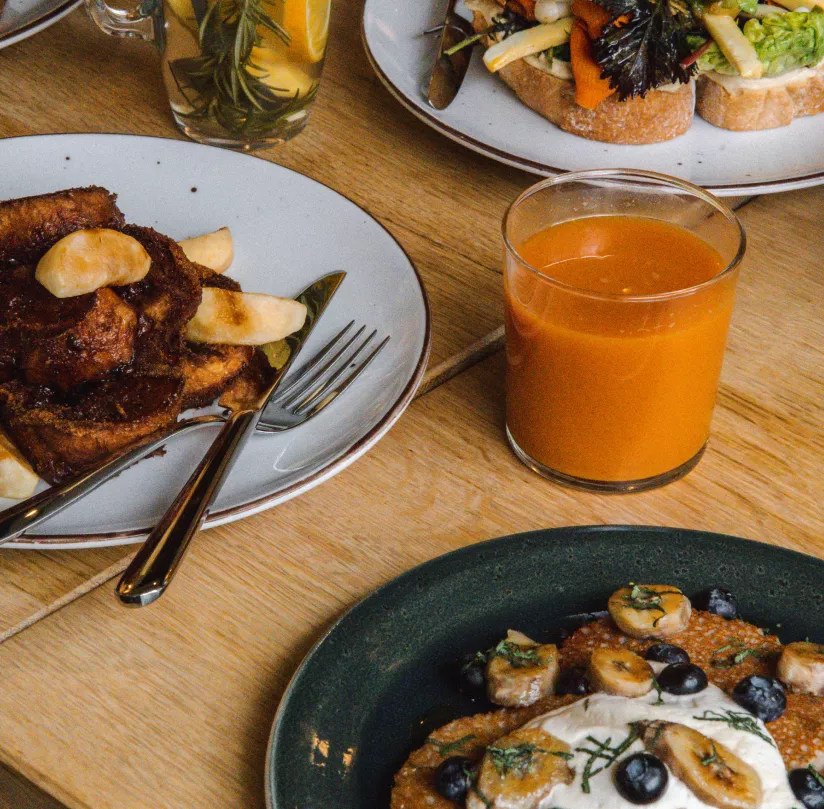
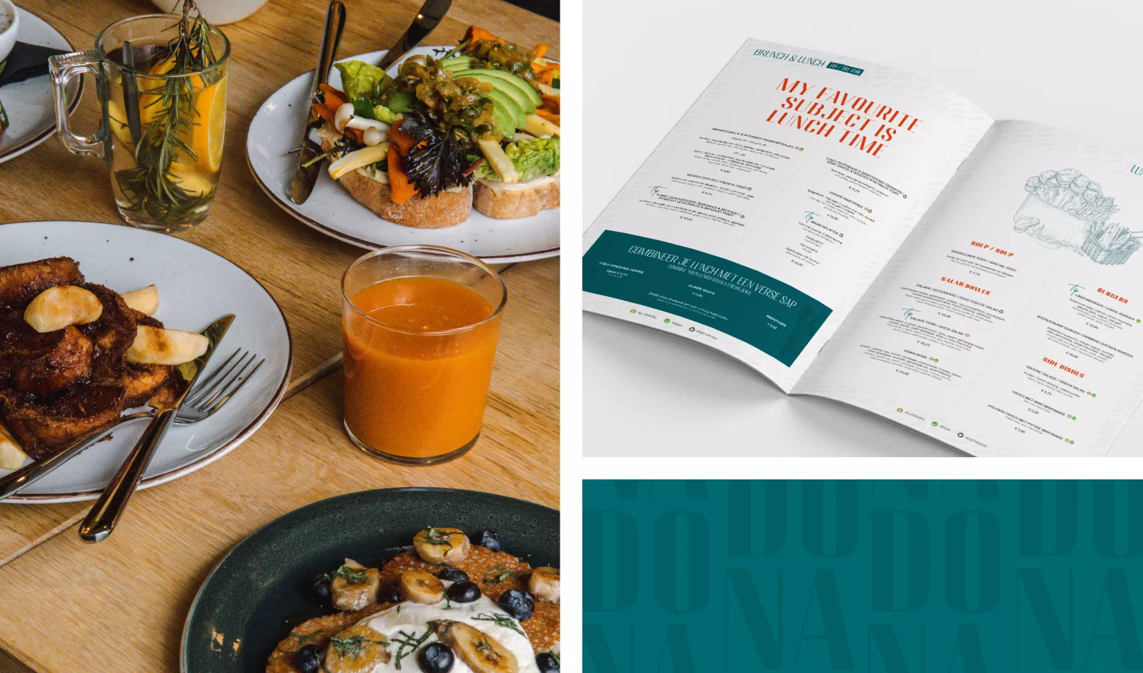
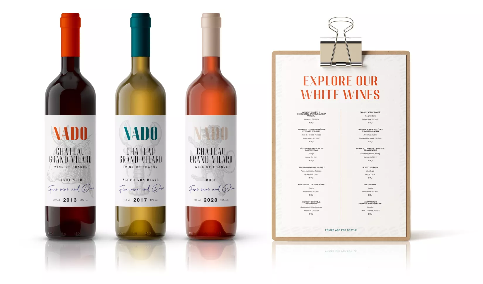
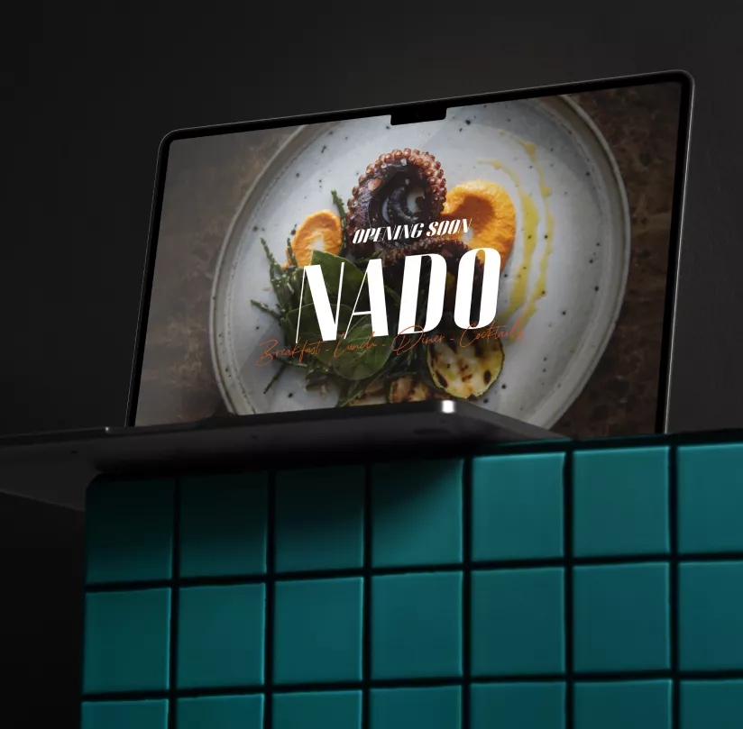
The visual language needed to stand up against brands like Vogue and the world-famous Danish restaurant noma. With a modern colour scheme, strong logo and header font, and the romantic, personal touch of the handwritten typeface North Avelion, we brought it all together. Combined with fitting photography, unique line drawings, and a versatile pattern, every detail was spot-on. All ingredients for the communication tools and restaurant décor were sourced locally. Mise en place? Check!