
Back

Bistroo

Branding | Campaign

Refinement of visual brand identity

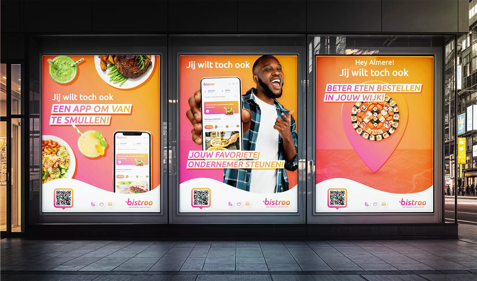
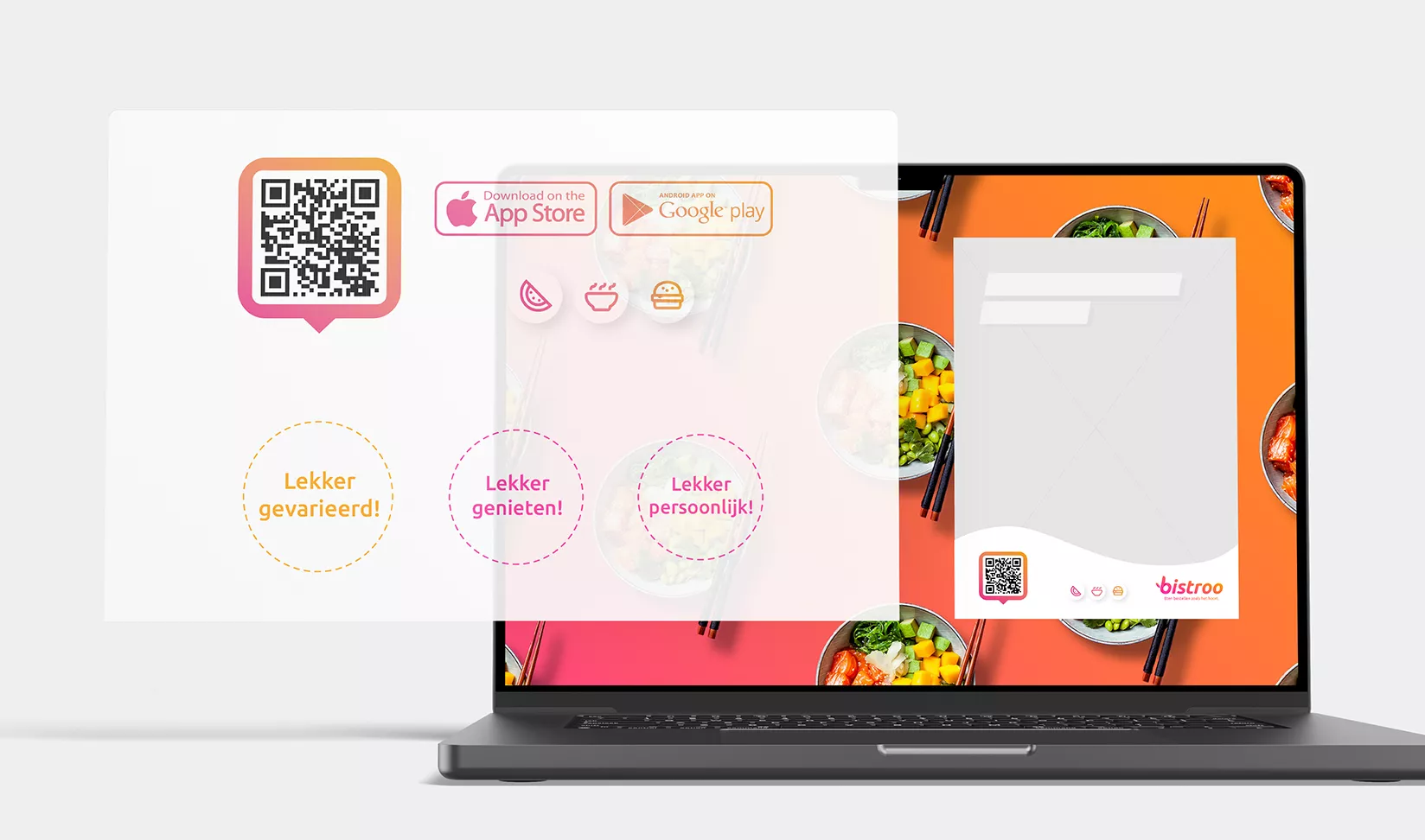
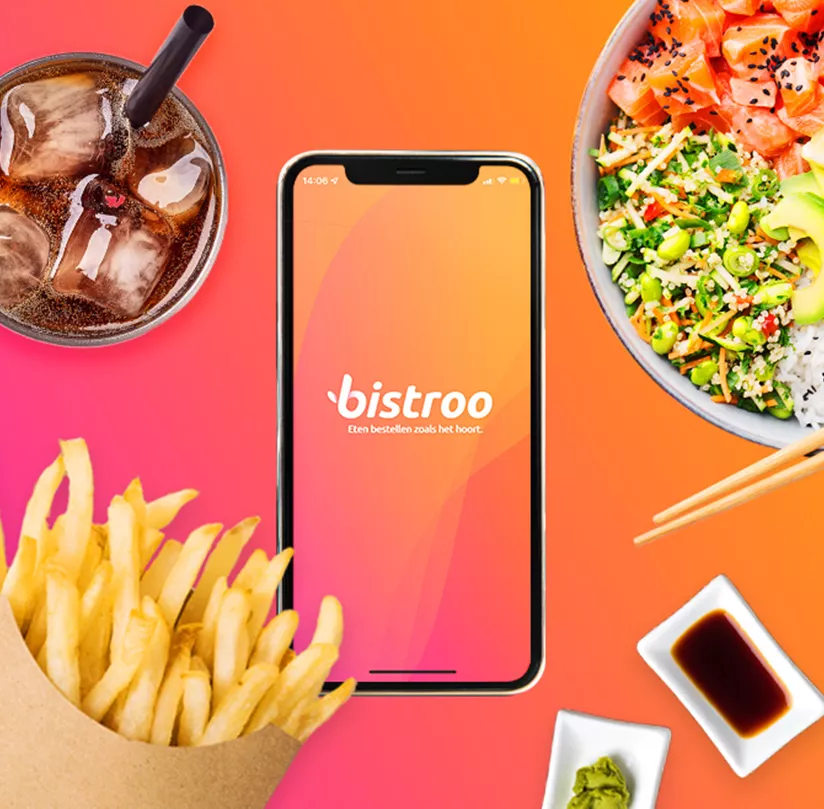
Our concrete task: to develop a refined look and feel that could be rolled out across a regional multichannel campaign, both online and offline. This needed to stay true to Bistroo’s existing brand colours, typography and other graphic elements. We began by defining core creative principles: Freedom, Fairness, Ease, Customer-Friendliness, Personal Touch, and Consciousness. Just as it should be. In line with the values of “Customer-Friendliness” and “Freedom”, we opted for a pink-orange gradient that flows smoothly within the existing colour palette.

We then worked with the Ubuntu font, using it consistently for both headers and body copy. This led to the creation of a striking message bar to communicate key campaign messages. Additional stylistic elements – such as icons and bold circular visuals – were designed to highlight brand values and USPs. All these elements came together in a structured communication grid, with consistent layouts for various formats across on- and offline media.
From brand story to campaign concept

With the right words and visuals in place, it was time to take a closer look at our two target groups: consumers and restaurateurs. What message and angle would best reach and convince them of Bistroo’s value? And how could we remain recognisable and consistent while communicating from the overarching brand story? A clear campaign concept was the solution. But first things first: what are our goals, our communication jobs to be done?

We defined which knowledge we wanted to deliver, which emotional connection to establish, and which behaviour to drive. For consumers, this translates into downloading the app and placing their first order. For restaurateurs, it means completing their registration and actively using Bistroo as their go-to mobile ordering platform for local specialities.

A strategic hook and clear angles of approach

To maintain consistency and recognisability across communications, we developed a strategic hook – such as a slogan, tagline or hashtag – that features in all messaging. For both target groups and across all touchpoints. By using a positive rhetorical question – “You want to … too, right?” – we not only engage the audience but also create space to tailor the message with various platform features, opportunities and brand values.

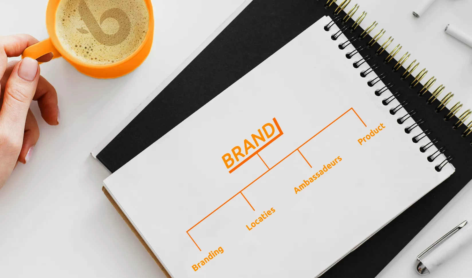
We placed the Bistroo brand at the heart of the campaign and organised our messaging around four key angles: Branding, Locations, Ambassadors and Product. These structured themes act as pillars for clear, distinctive communication in a recognisable style.

The team

Soraya Stout
Creative Designer
Steven Olde Hengel
Head of Creativity