
Brand story: the perfect balance of emotion and logic
A good story is credible, authentic, persuasive, and aligned with the desires and needs of its audience. The brand story we developed for Oat of this World ticks all those boxes. By striking a balance between emotion and rationality — and adding a dose of playful language — the story came together beautifully.
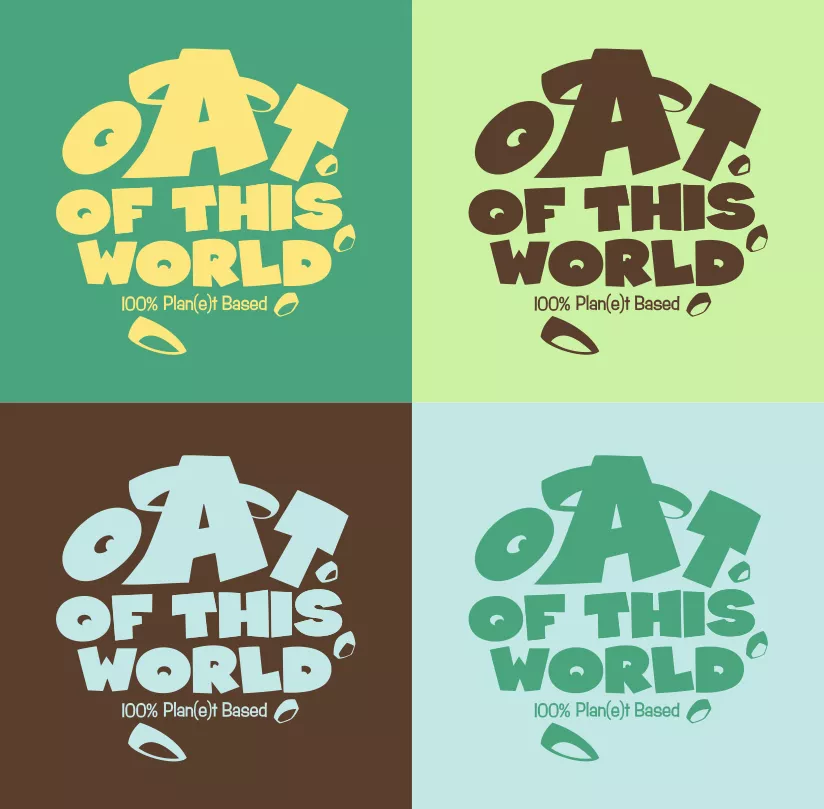
And the name? “Oat” wasn’t chosen at random. The vegan, lactose- and gluten-free options in this new MAAS label are oat-based. Conveniently, the word “Oat” sounds like “Out” in English, a word we wove into the brand story wherever possible. Take this stanza, for example:
Responsible never goes oat of style. Doesn’t it?
We’re oat of this world,
And we are here to stay.
In a sustainable, healthy, and tasty way!