Back

Volta Energy

Branding | Seduction

author
Tim van Es
Brand Manager & Brand Strategist

PROJECT

Volta Energy replaces polluting diesel generators with mobile solar power stations at construction sites and events. Their technology is the new standard, but their visual identity lagged behind. The challenge: translate this innovative spirit into a bold brand identity ready for international expansion.

SOLUTION

We refined the brand into a timeless, international identity. Using the “Solar Lines” illustration system, a well-thought-out photography concept, and AI-driven design assets, we position Volta as the established authority in zero-emission energy. The result: a scalable brand identity and a drastically shorter time-to-market for new communications.
Website: https://volta-energy.com/

Results

  • AUTHORITY IN LOW-EMISSION ENERGY FOR CONSTRUCTION AND TELECOMMUNICATIONS
  • 30% Faster time to market thanks to AI
  • 100% SCALABLE FOR INTERNATIONAL EXPANSION
Looking Ahead

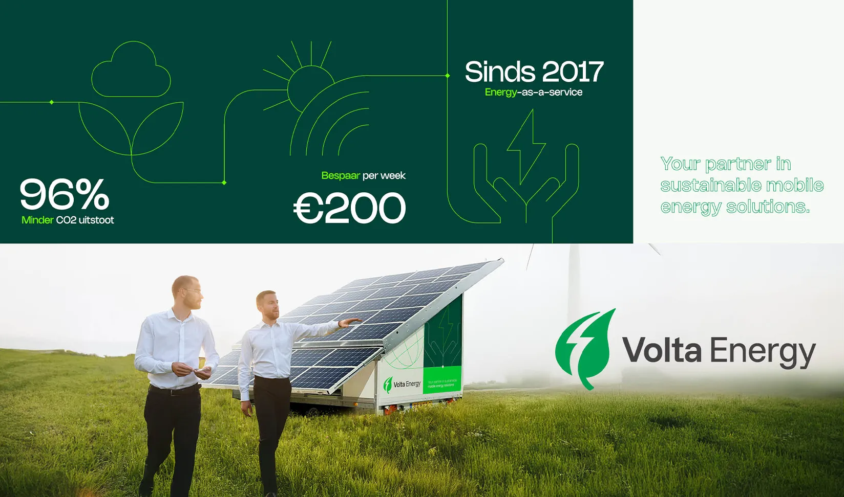
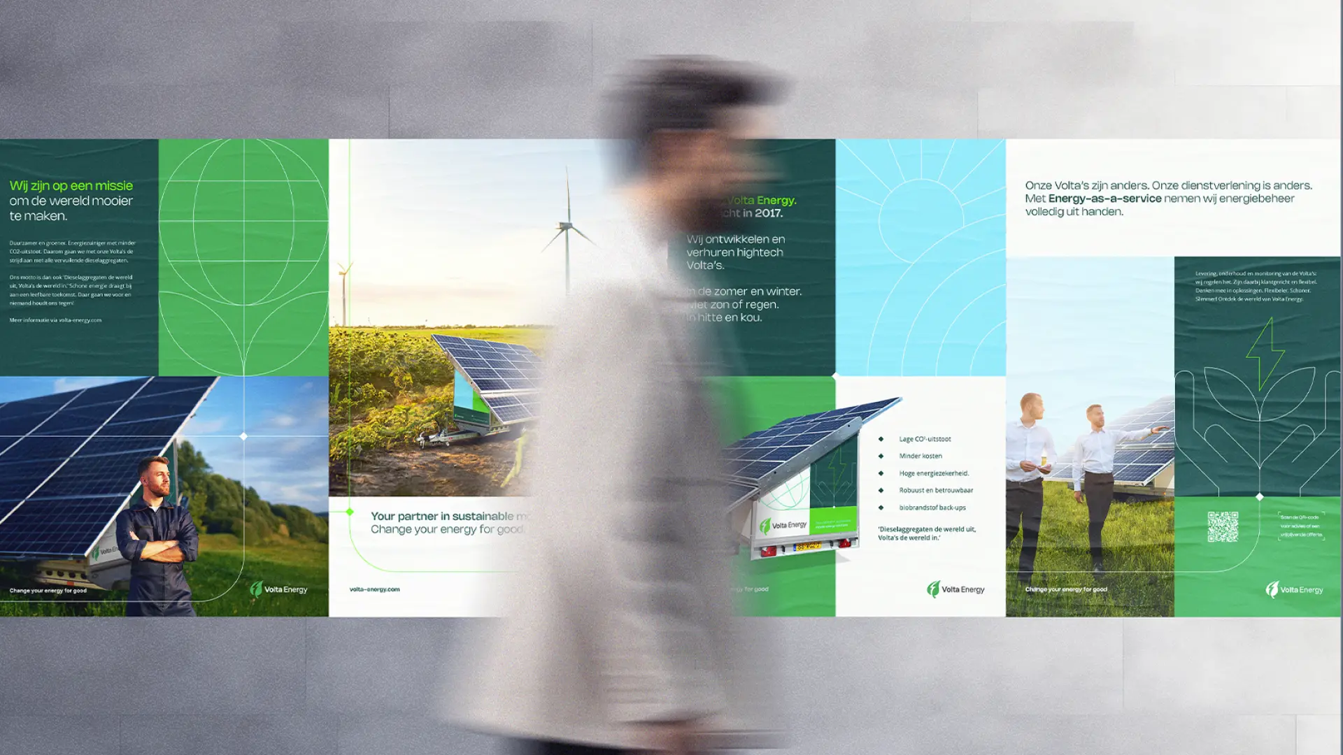
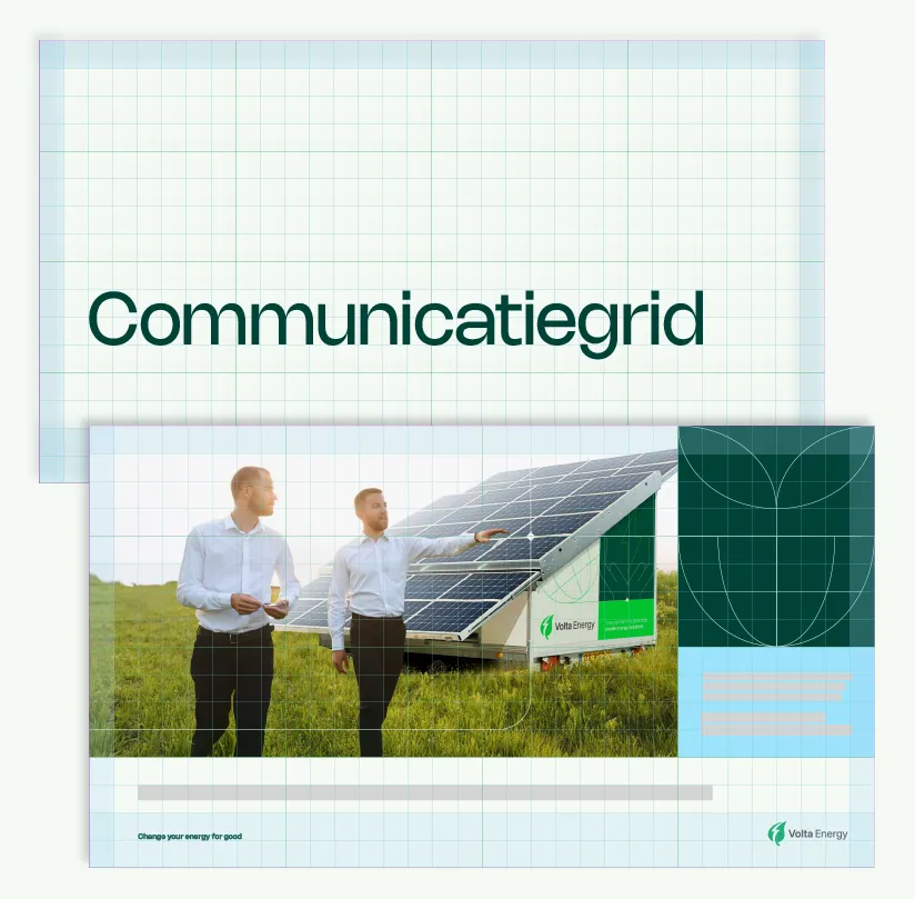
In this new photography, nothing is left to chance. The product takes center stage, but people bring the story to life. Our unique photography recommendation: People should always look toward the upper right. This not only aligns with the physical shape of the solar panels but also serves as a powerful visual symbol of progress, development, and the brand’s unstoppable growth.

'Solar lines'

To visually reinforce the technology behind the Volta panels, we developed a clean system of icons and line illustrations. These “Solar lines” are directly derived from the interplay of lines in solar panels. They serve as a common thread throughout our communications and symbolize the path Volta takes to guide customers toward the right sustainable solution. This grid ensures consistency in everything—from infographics to the decals on the units.

Improving the world together

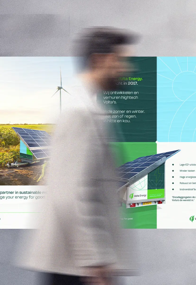
At Volta Energy, you don’t just become a customer—you become part of the community. That’s why our tone of voice emphasizes partnership. We reinforce this with powerful copy and a clear color palette. The familiar “Volta Green” is complemented by a stable deep green and a fresh sky blue; this is how we build a brand that inspires trust among partners and takes on polluting generators.

Design never stands still

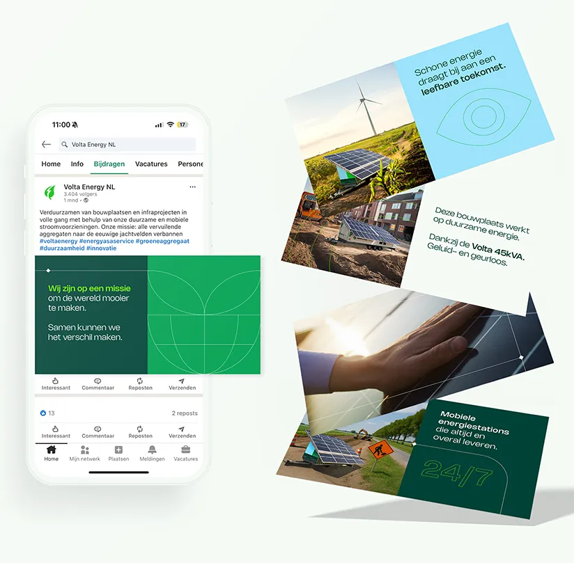
Following the rebranding, we immediately applied the new style to all touchpoints where the brand had previously faltered—from professional email signatures and stationery to pitch presentations and a complete icon set. Thanks to the smart use of AI-driven design assets, the Volta team can now independently and consistently produce communications that live up to their ambition: making the world more beautiful and sustainable.