Back

Harvest House

Brand strategy | Branding | Packaging

A brand rooted in the greenhouse: strategic positioning

The brand strategy for Harvest House was built around one unifying idea: independence is something you achieve together. Based on this belief, we developed a brand foundation tailored to an international cooperative of engaged growers with a shared mission. We began by refining the vision, mission, core values and brand personality. Key themes included decisiveness, professionalism, entrepreneurship, connection and transparency. We then translated this internal identity into a visual style and tone of voice that makes the organisation both recognisable and distinctive. The combination of strategic thinking and creative development resulted in a brand that is embraced internally and expressed consistently externally. It not only tells the story of what Harvest House stands for but also inspires continued collaboration towards a healthier global food chain.
A visual language in full bloom

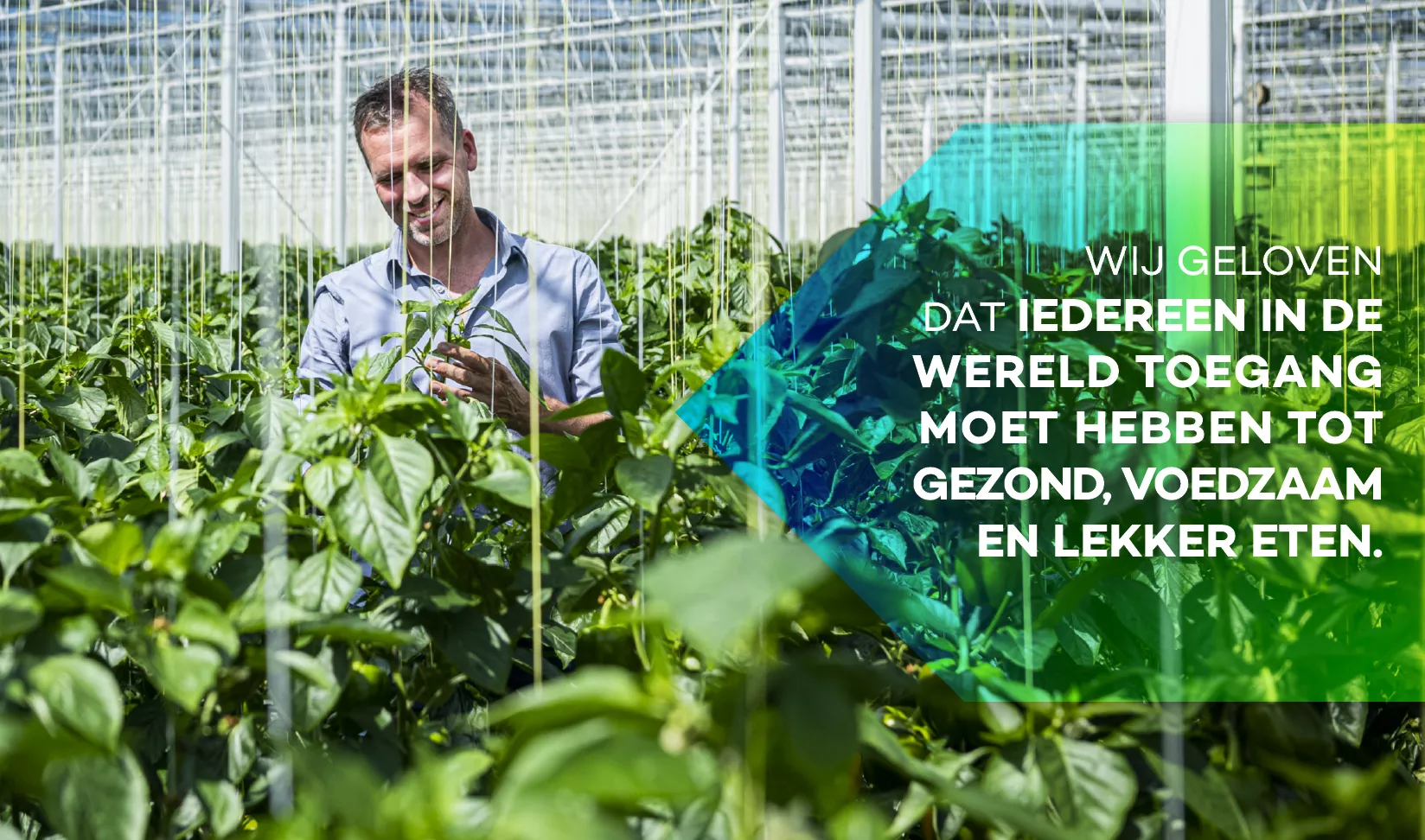
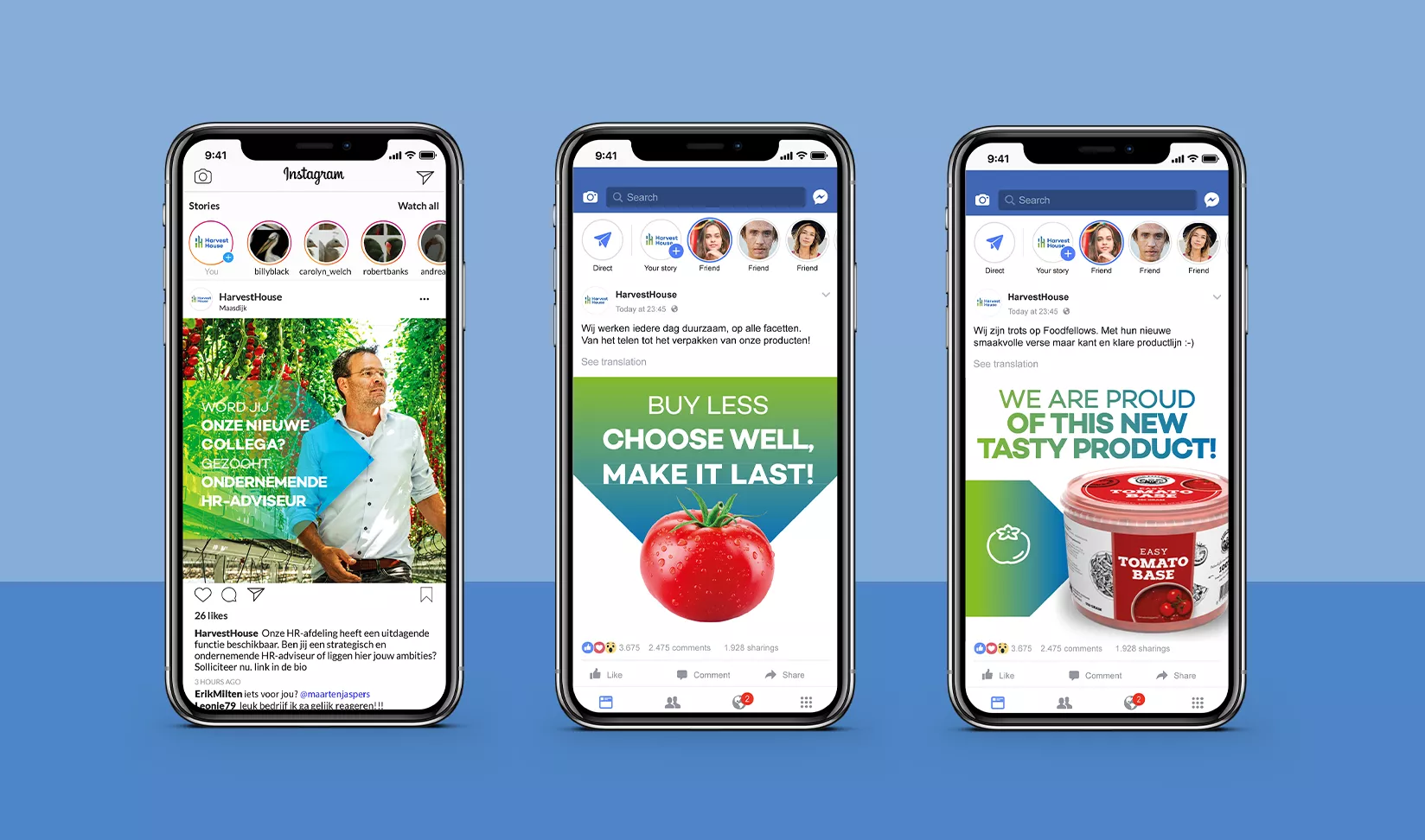
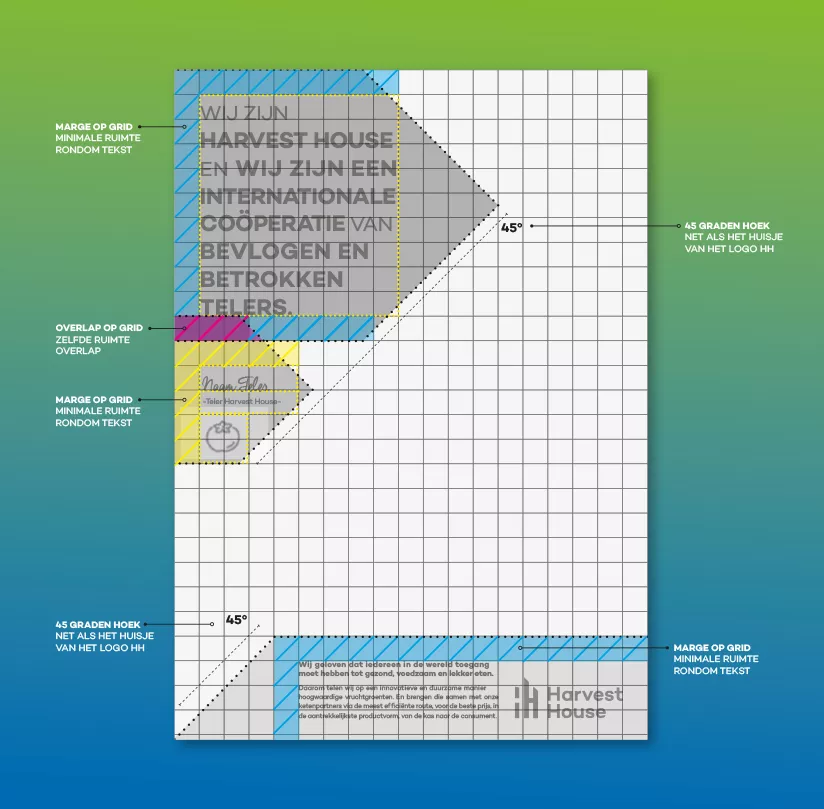
Based on the brand positioning, we developed a visual identity that brings Harvest House’s mission to life. Central to this is a communication grid that ensures visual consistency while allowing enough flexibility to cater to various needs. Whether it's communication with growers, partner presentations or internal materials—the grid forms a solid base.

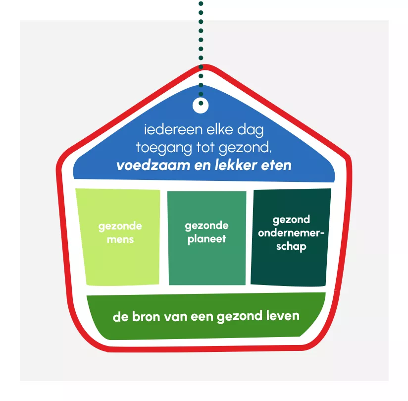
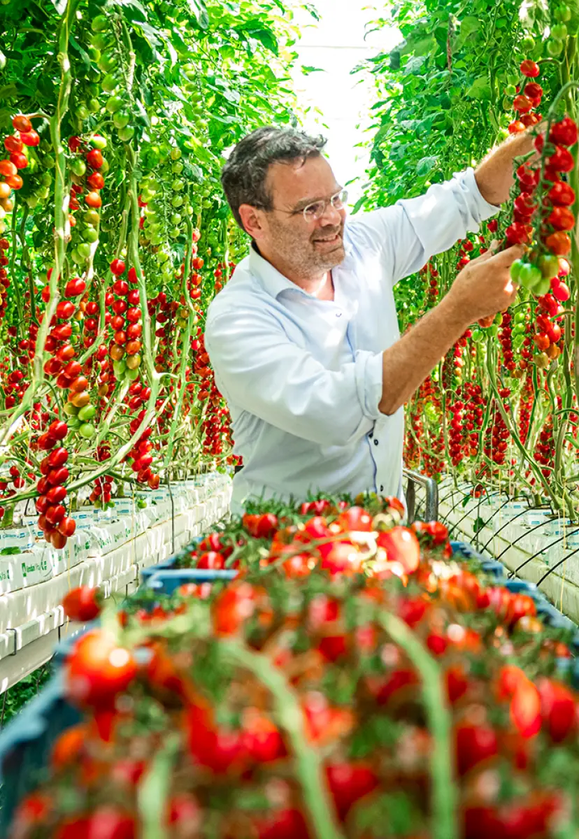
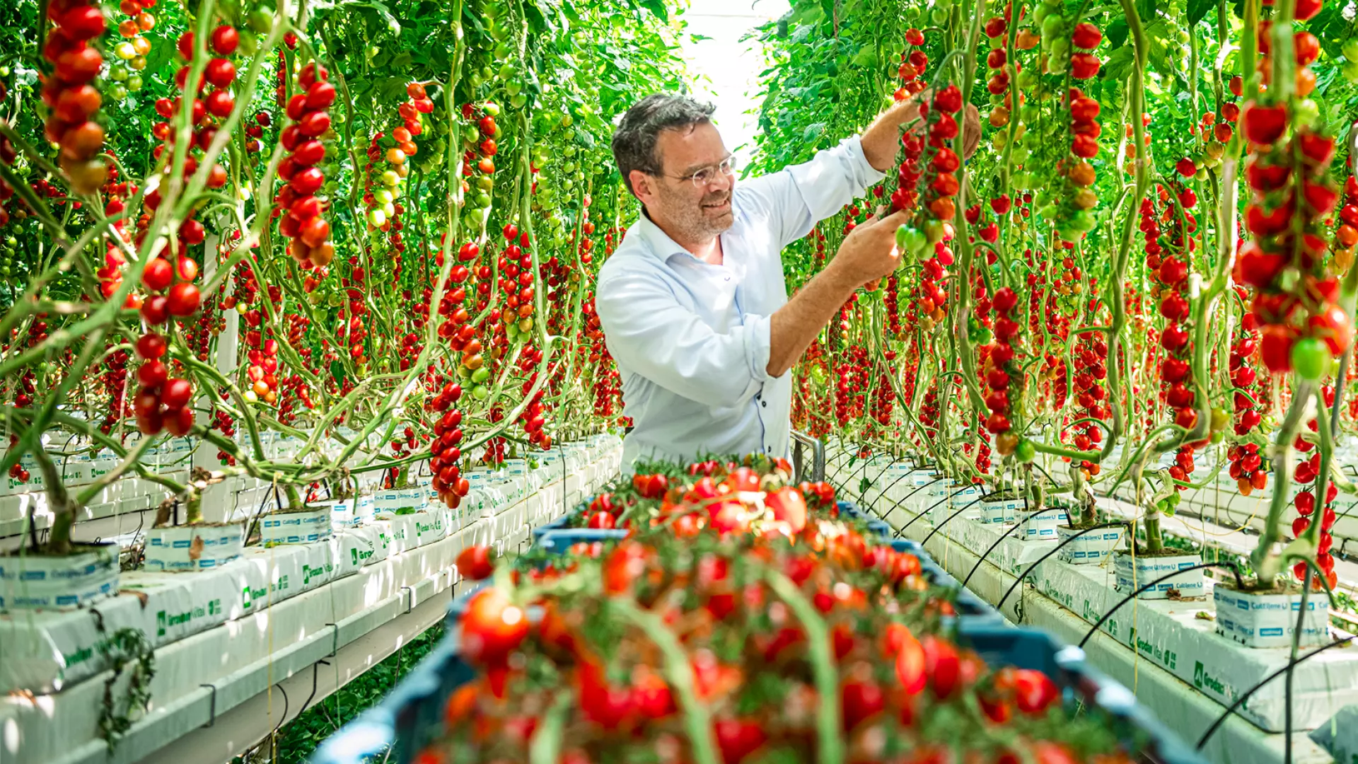
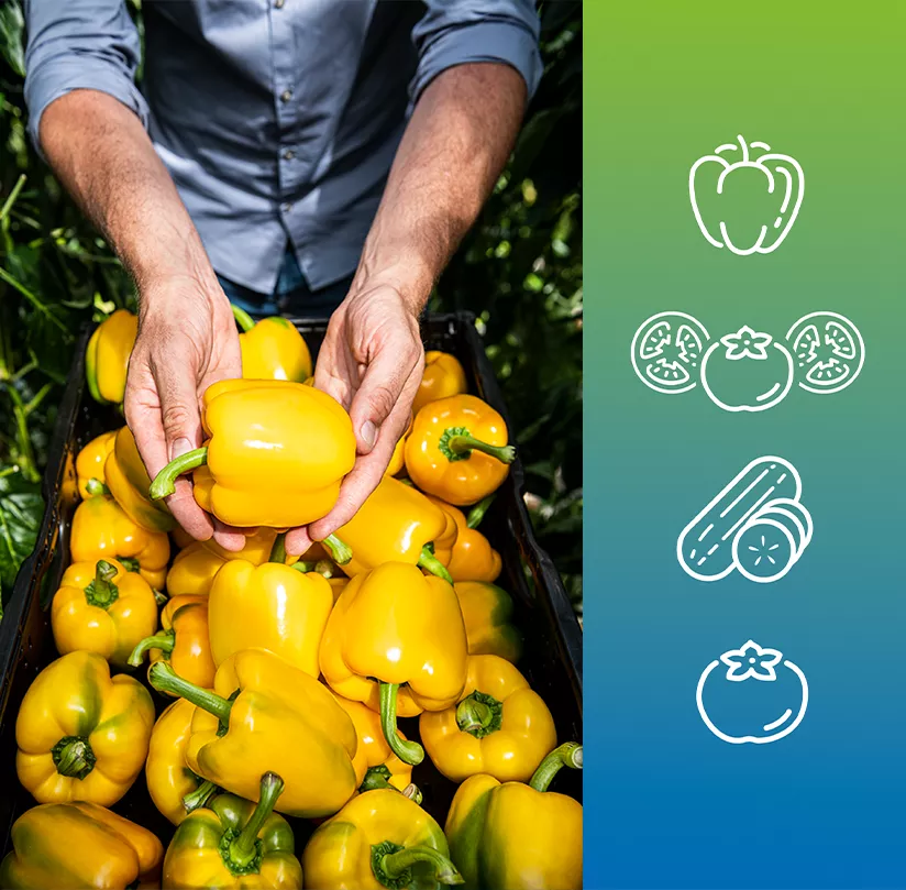
We retained existing brand elements such as colour and logo to preserve familiarity. New additions include the bold use of graphic shapes derived from the logo, a refined typographic system featuring Campton and the handwritten Cheddar Jack font, and a set of clean outline icons. Photography plays a crucial role: real people, genuine moments, presented in a stylised yet sincere manner. All of this contributes to a distinctive visual identity that reflects Harvest House’s values: down-to-earth, ambitious, and committed. A visual system rooted in practice, yet ready for the future.

At Harvest House, sustainability is central

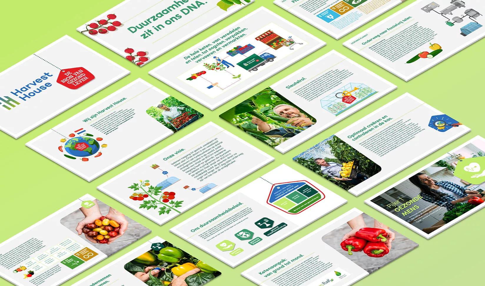
“Sustainability is in our DNA”: the telling subtitle of the sustainability manifesto. So serious is Harvest House’s commitment to sustainability that we were able to create an entire book on the topic — and they even launched a dedicated website. The book, along with its spin-offs such as a mini brochure and infographic, is full of insights: from strategic sustainability pillars to informative content, all wrapped in a specially developed sustainable visual style. The result? A surprising yet seamless extension of the core corporate identity.

Rebranding Food Fellows: less waste, more taste

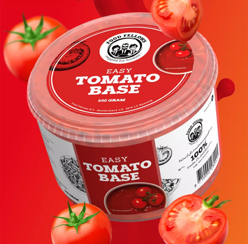
Why waste something that tastes great? Food Fellows, a Harvest House initiative launched in 2017, represents the next step in sustainability. With large volumes of fruit vegetables grown across the cooperative, many "imperfect" products don’t meet retail standards — despite being just as delicious. Food Fellows turns these into flavourful, healthy sauces and blends: rich in nutrients and free from unnecessary additives. Sustainably produced, with minimal waste. In the Food Fellows kitchen, no veg is left behind.

For this wonderful initiative, Redkiwi developed a strategic brand story and executed a full visual rebrand — including a fresh communication grid and new product packaging.

Want to know more about this case?