About Freeday
Welcome to Freeday, Europe's leading platform for staffing digital employees. The name Freeday comes from the idea that everyone should have Fridays off. It's a lighthearted statement, but one that Freeday takes very seriously. The digital AI employees of Freeday handle boring, repetitive tasks for you, rewriting the way we work and interact. This enables people to collaborate better, solve complex problems, and focus on the enjoyable aspects of their work. We unlock human potential.
Visual language
Freeday is exciting, competent, and fun! It possesses a youthful and ambitious character with bold statements. This DNA combines with a reliable, secure, and intelligent service in the form of AI employees. In the visual translation, this means a corporate identity where the visuals reinforce and amplify Freeday's voice, eliciting emotions in the target audience. Our task is to design a new corporate identity that exudes ambition, positivity, success, and distinctiveness.
Style elements
A visual language consists of elements: fonts, logo, color palette, and other style elements that define it. For Freeday, an eye-catching, youthful, and vibrant color palette of purple, pink, and blue tones was chosen, with a warm orange color as a supporting accent to emphasize specific messages. When we figuratively "smash" the new Freeday logo with a hammer, it transforms into a so-called "smashable" logo – recognizable elements and shapes that can be used as both on- and offline graphic elements.
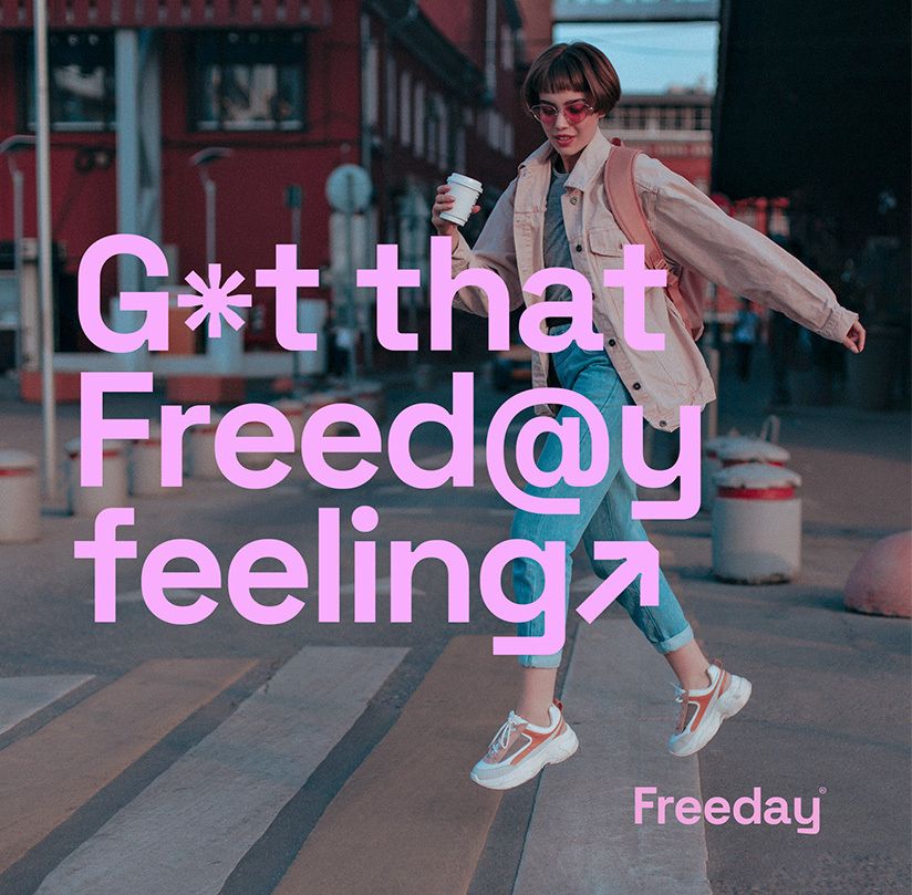
To visually express the digital aspect of Freeday, the fonts make extensive use of glyphs or symbols. These characters can replace letters while maintaining the readability of each expression.
Imagery
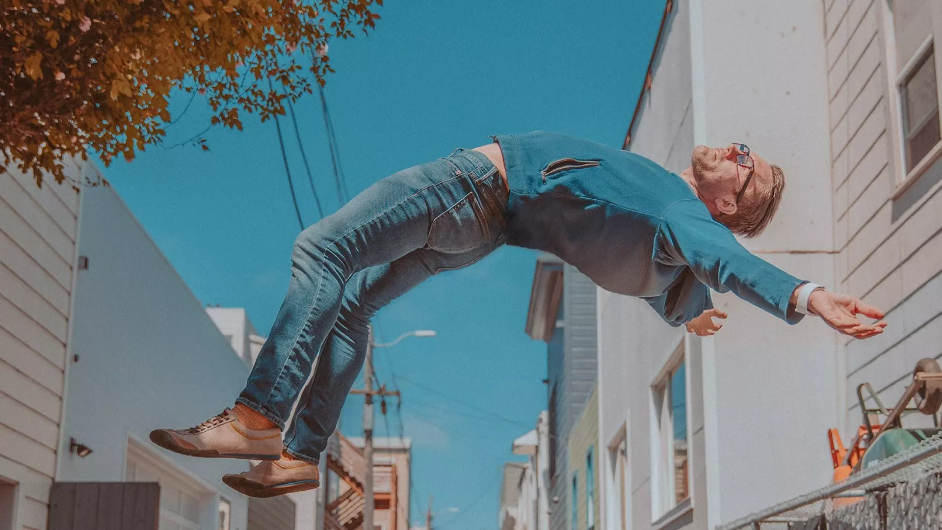
With Freeday, AI employees take over repetitive, mundane tasks, leaving the enjoyable work for humans. This naturally enhances the quality of life, giving a sense of gravity-defying, floating freedom and joy. This feeling of freedom, happiness, and strength is reflected in the photography.
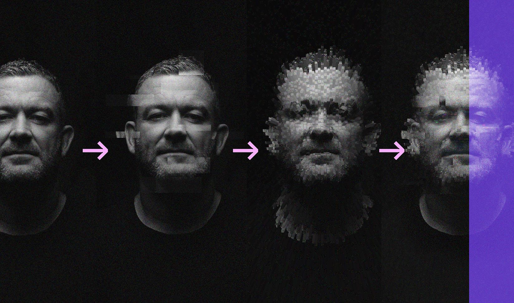
In addition to the target audience photography, it was our task to give the digital AI employees a human face. A face that reveals their AI characteristics but still appears friendly and trustworthy. For this purpose, a custom Glitch photo filter was developed, allowing Freeday to easily give each new AI employee a face.
Campaign
Building upon the existing brand positioning, we focused on storytelling (content) – multiple storylines incorporating the core messages. The communication in the strategic concept is divided into the storylines: Branding, Proposition, and Digital Employees.
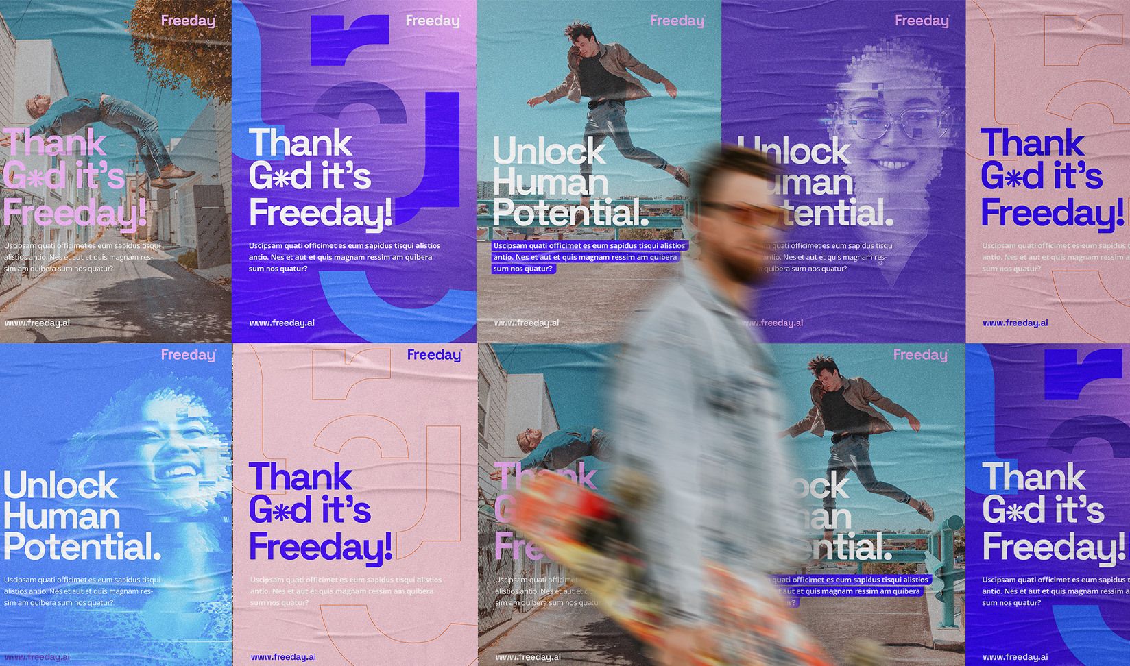
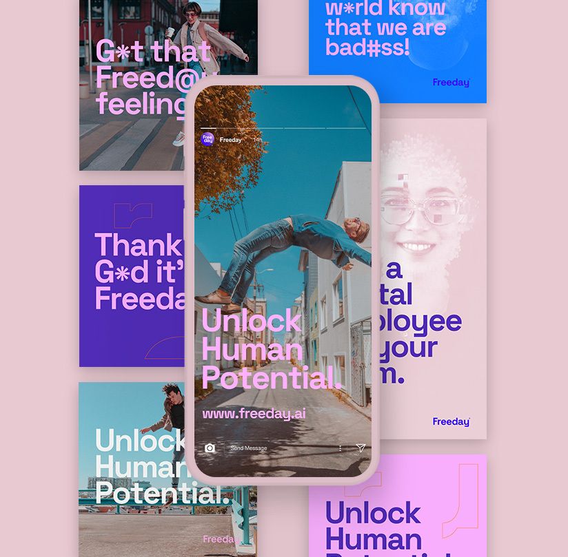
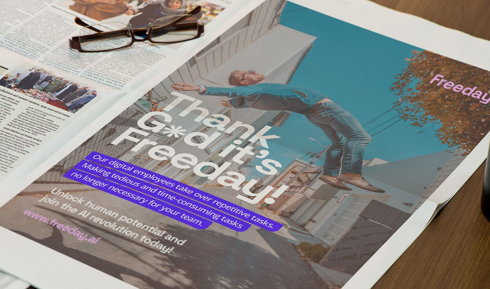
From these storylines, we identified four different strategic hooks. One concept revolves around the idea behind the Freeday name, emphasizing that every Friday should be a day off. This resulted in the concept "Thank G*d it's Freeday!" showcasing the euphoria and invincibility felt by the target audience after experiencing the benefits of Freeday.
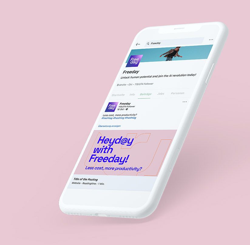
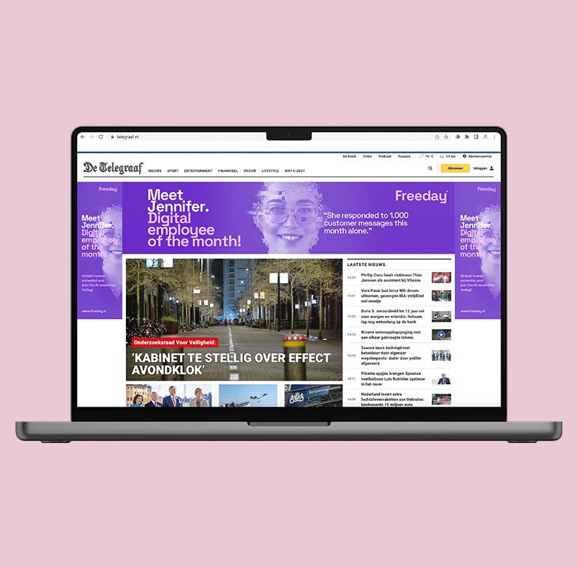
Another concept plays on the familiar concept of "Employee of the Month." While typically reserved for "real people," why not include digital employees? Hence, the concept "Digital Employee of the Month!" spotlights Freeday's AI employees, supported by a quote from a human employee. It's a creative way to communicate the unique selling points of the service.
UX/UI
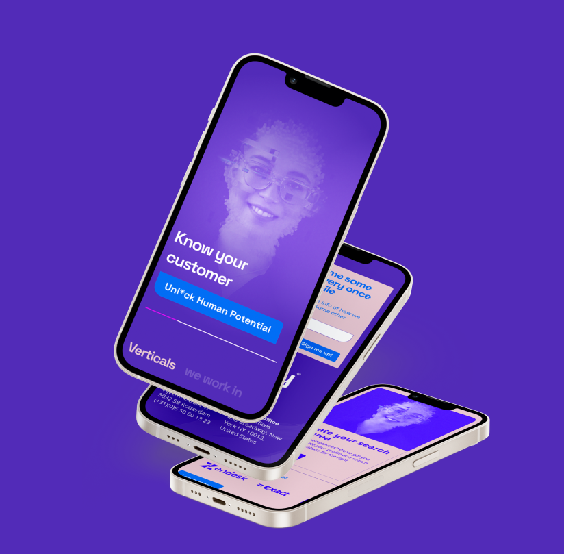
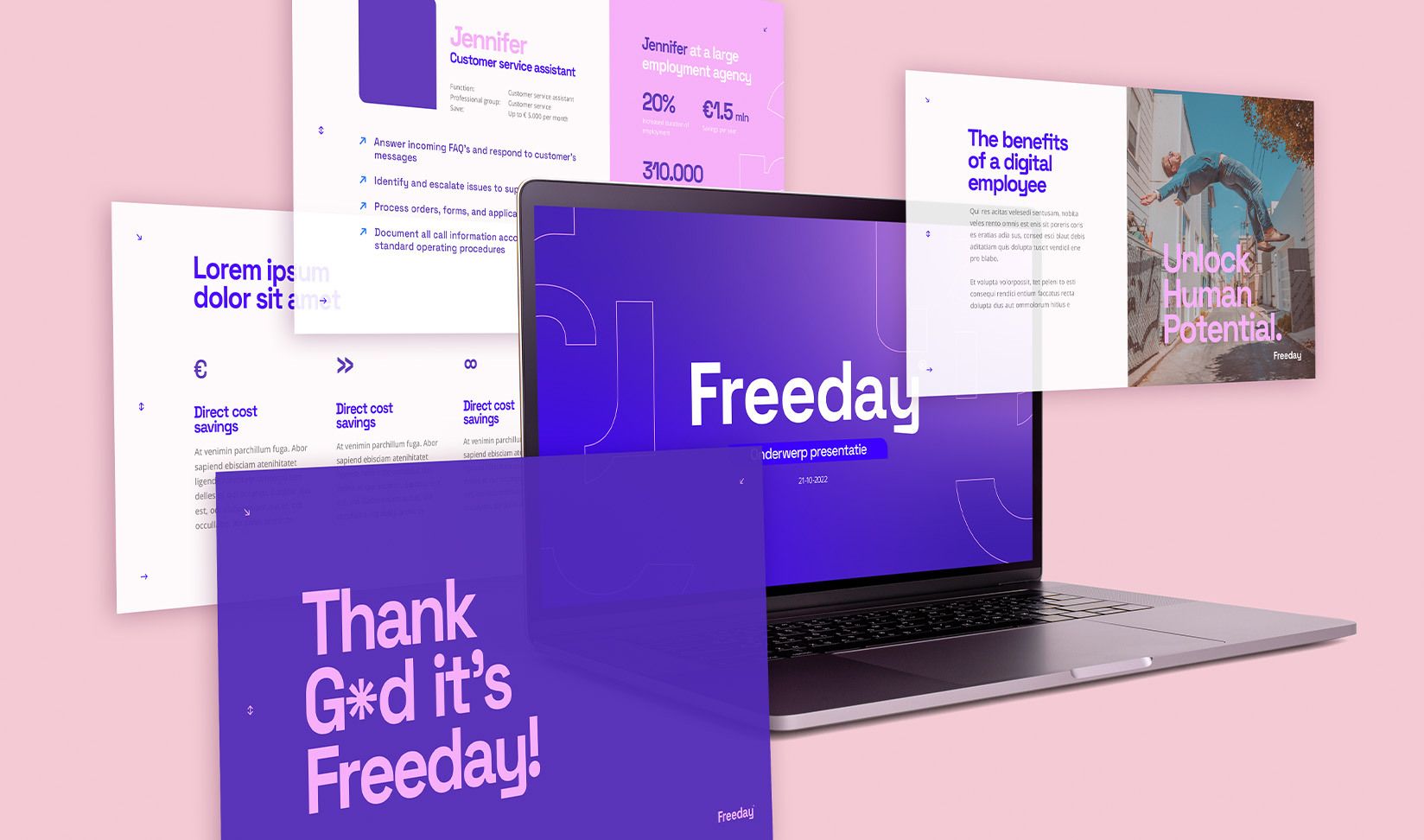
With the completion of the development of the unique visual language, it was time for web design. We creatively approached the design while staying within the boundaries of online convenience, aiming for a strong UX design and appealing UI design. We are building a digital world where the end-user takes center stage—an interactive and validated online realm.
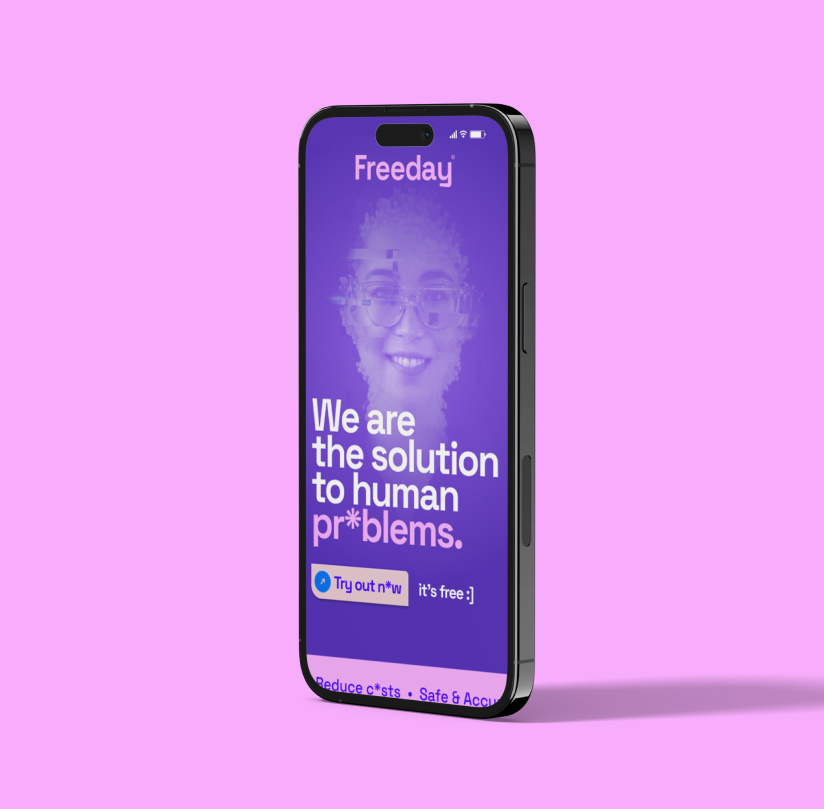
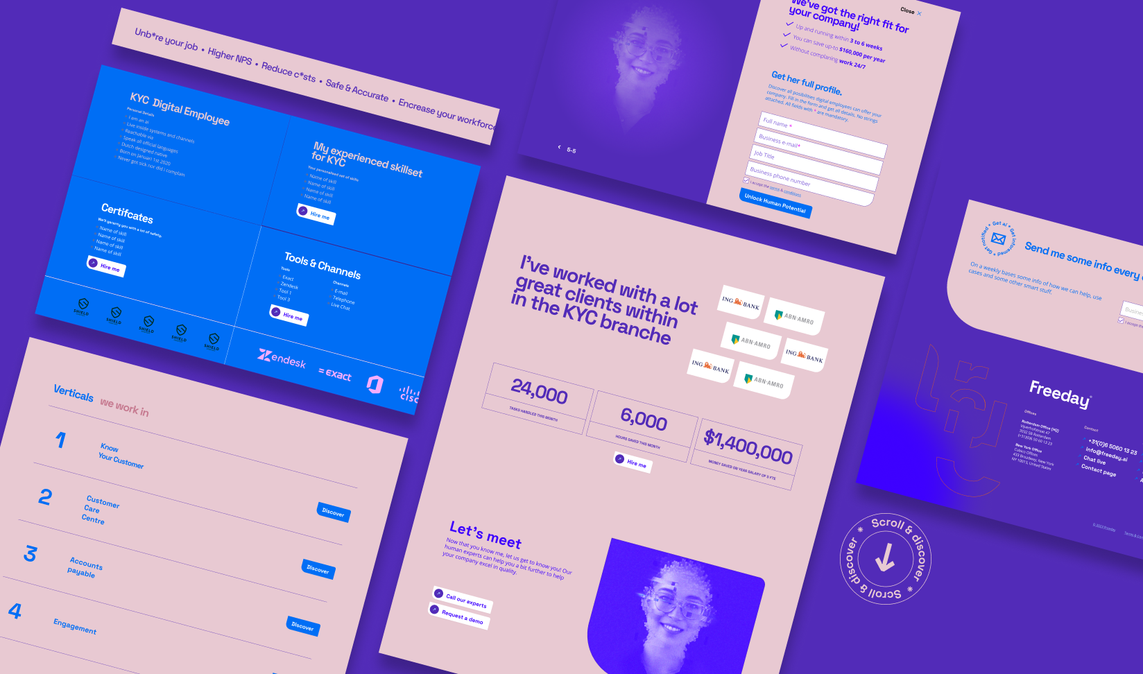
When you focus on UX, you're fine-tuning the keys to your success. UX allows you to delve into what your customer, and thus the online user, truly needs. With our design for Freeday, visitors are pleasantly surprised by a high level of interaction and a vibrant color palette that jumps off the screen.