Positioning
In the strategic positioning, it is essential to highlight the main strength of HNPF. Both in the form of the pay-off and in the story to tell: the power of the independent collective. Independence leads to making the best choices and considerations in the interest of the participants of the pension funds. By uniting forces with Dutch employers and their funds, HNPF provides certainty, achieves economies of scale with collective rings, reduces costs, and enables sustainable, responsible investing for the benefit of participants. That is what drives HNPF.
Approach
HNPF is agile and adaptive. Innovative and enterprising. It understands the dynamics and preferences of large employers. It reduces costs, takes care of the operational tasks, and ensures the necessary legal and financial governance.
It saves time and collaborates with personalized attention. By uniting forces with Dutch employers and their funds, HNPF achieves scalability, effectiveness, and synergy. While everyone retains their own identity and influence.
Branding
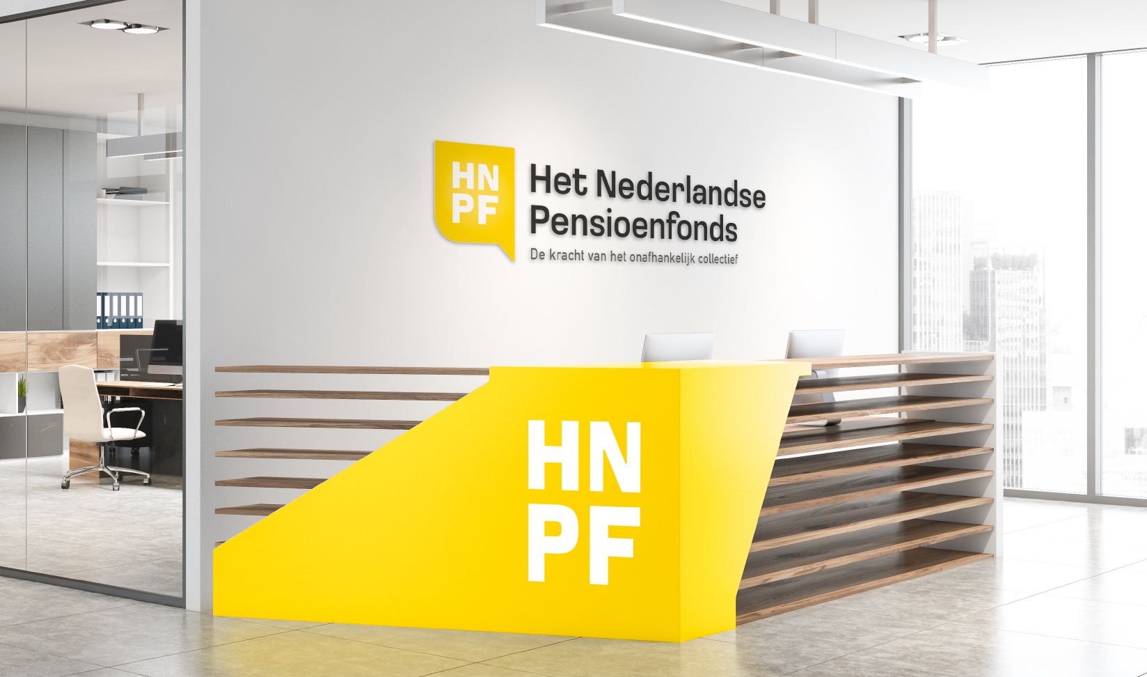
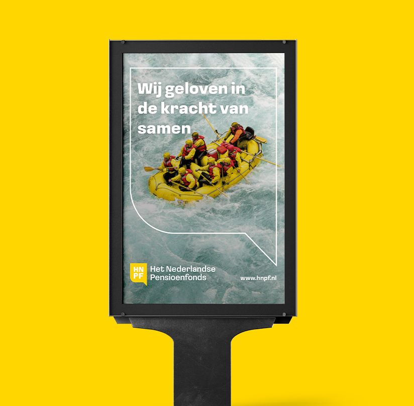
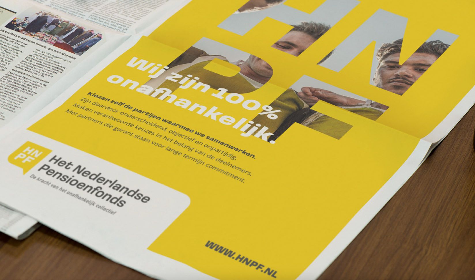
Based on the strategic positioning, we identified several principles for developing the renewed visual language. We found warmth and humanity in the collective and the power of collaboration. Additionally, HNPF operates without gimmicks and in plain language. This simplicity needed to be visually represented. Moreover, after conducting a competitive analysis, it was determined that the visual language should be distinctive with a fresh, modern, yet professional and warm color palette. The personal aspect is translated into the visual language through a logo that reflects the power of conversation and personal connection between people: it depicts a dialogue. A conversation between colleagues, between advisor and client, or among customers from different sectors.
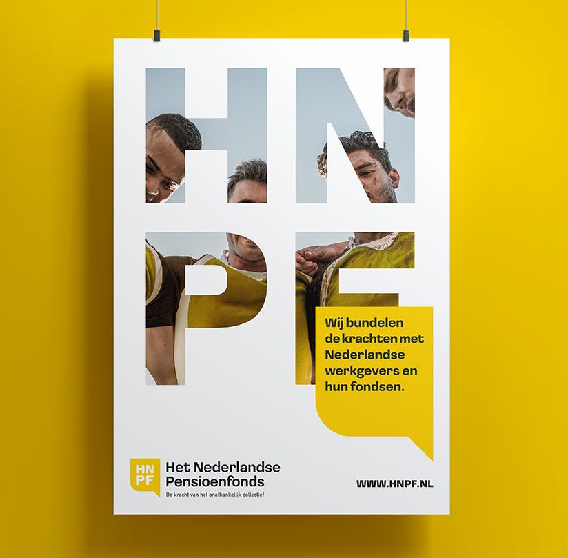
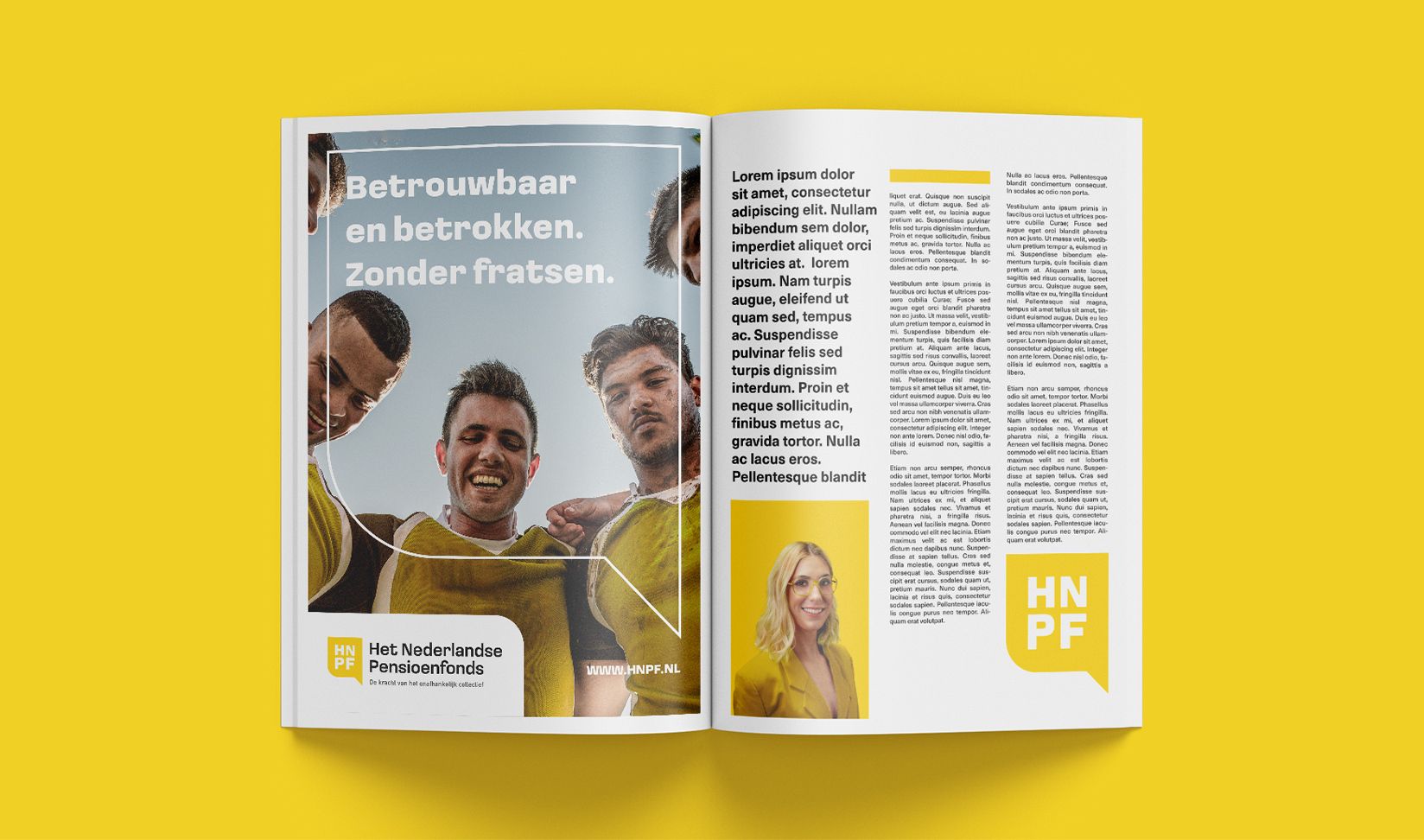
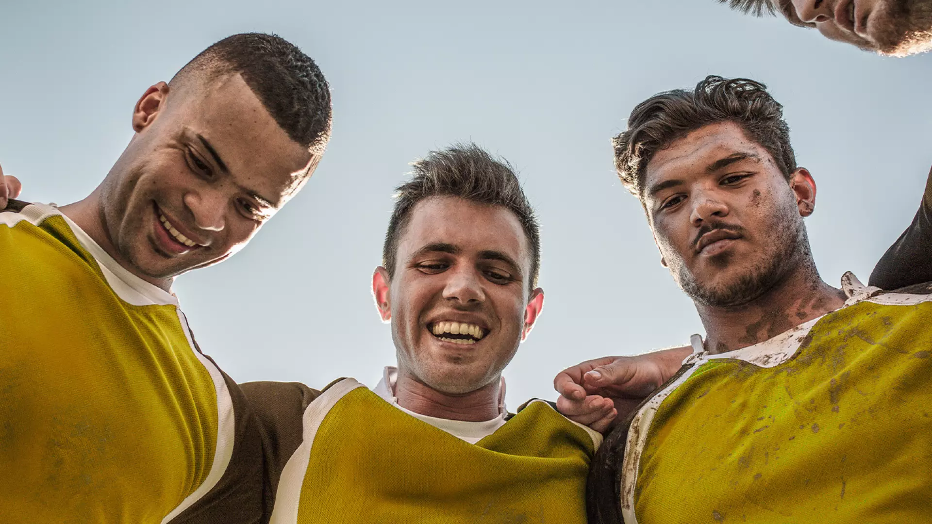
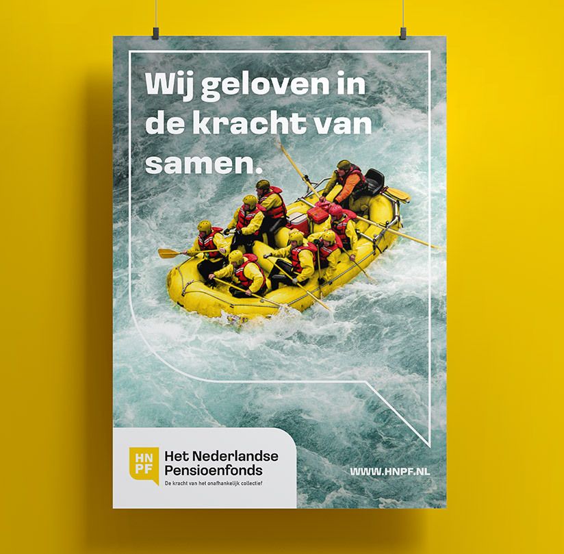
In the matching color palette, we incorporate the positive yellow and professional black. These are complemented by a neutral shade of gray and a unique, individualistic turquoise accent color that is present in the supporting photography. The photography always focuses on showcasing the power of collaboration.
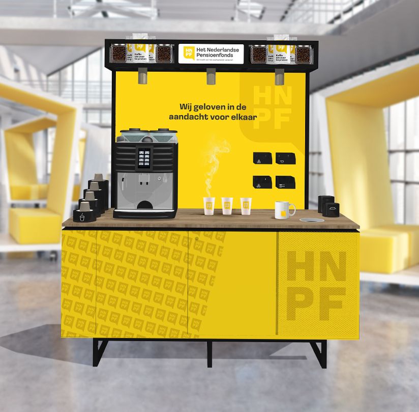
The developed style elements come together in a cohesive communication grid that ensures recognizable communication, no matter which type of channel is utilized.
Want to know more about this case?