
Back

FlowFitness

Brand strategy | Branding | UX/UI | Target Audience

Target audience analysis

Before developing the new strategic positioning for Flow Fitness, we started by conducting a target audience analysis. The target audience can roughly be divided into consumers and dealers. Additionally, there was a desire to modify the group of current consumers towards an equal distribution of male and female users, lowering the average age of users, and increasing market share in the Randstad and North Netherlands for a nationwide presence.
Let's do this!

Attracting new target audiences

To appeal to new target audiences, a powerful strategic positioning was necessary. A positioning that clearly highlights Flow Fitness across four quadrants: convenience, design, health, and motivation. Four quadrants that collectively ensure the user enters the right flow – the optimal mental state where an individual performing an activity is fully immersed in a sense of energetic focus, complete engagement, and enjoyment in the process of the activity. With Flow Fitness, we eliminate barriers and make exercise and movement accessible. The essence of the brand is encapsulated in an inspiring brand story, complemented by the motivating tagline, "Let's do this!"

Refinement of visual language

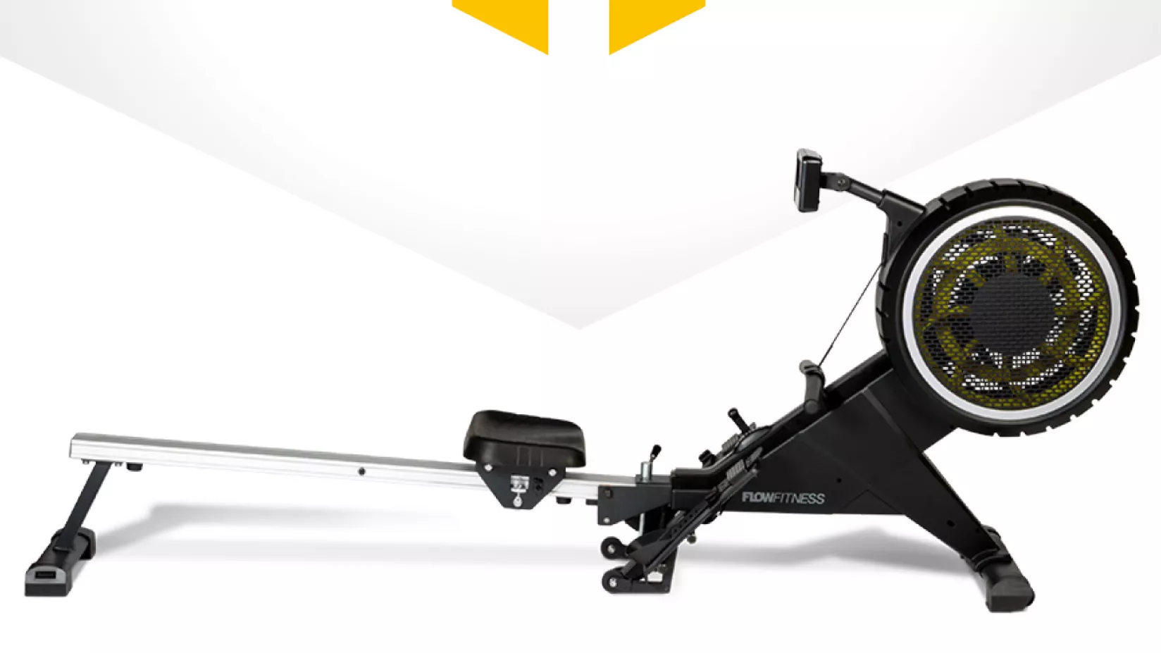
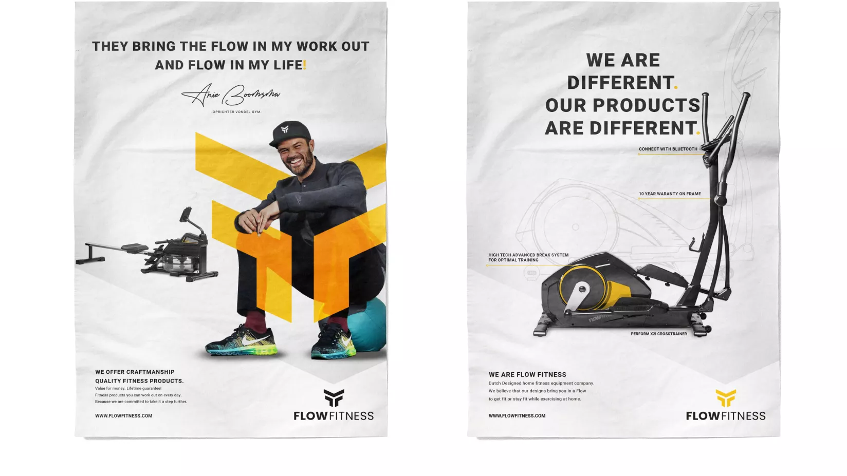
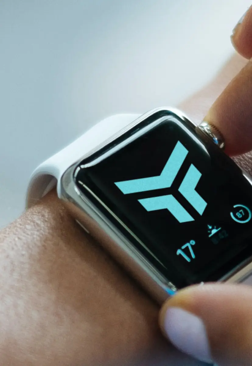
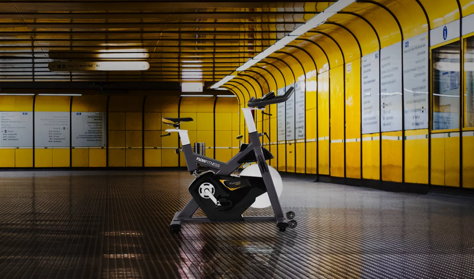
To align the visual style of Flow Fitness with the new strategic positioning, a refinement of the visual language has been implemented. This involves a redesigned modern logo and the addition of some eye-catching style elements. By aligning with modern logos of other major brands, we opted for a minimalist, flat logo that can be used in either 1 or 2 colors. To convey reliability, we chose an energetic combination of two strong fonts, both highly legible, professional, and yet personal. In photography, we emphasize the quality and design of the Flow Fitness range. We showcase a diverse target audience in their personal environments to highlight at-home workouts.

Communication grid & inspiration book

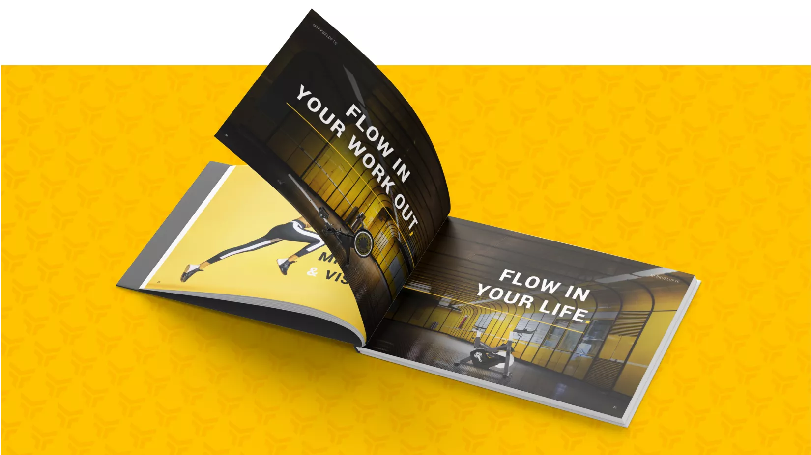
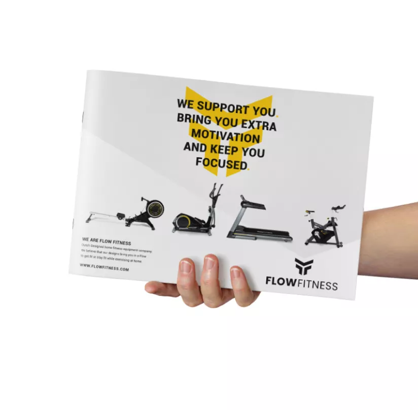
The elements of the refined visual language were then translated into a communication grid, making all on- and offline communication recognizable. The guidelines regarding the use of the visual language have been translated into an Inspiration Book, filled with key do's and don'ts, combined with the strategic positioning and various examples of communication. The new visual language was later implemented in the layout of a new product brochure.

Want to know more about this case?