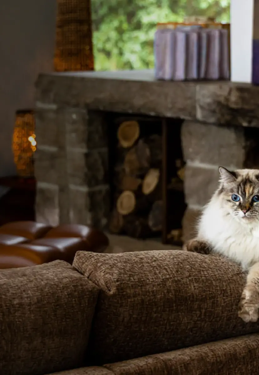
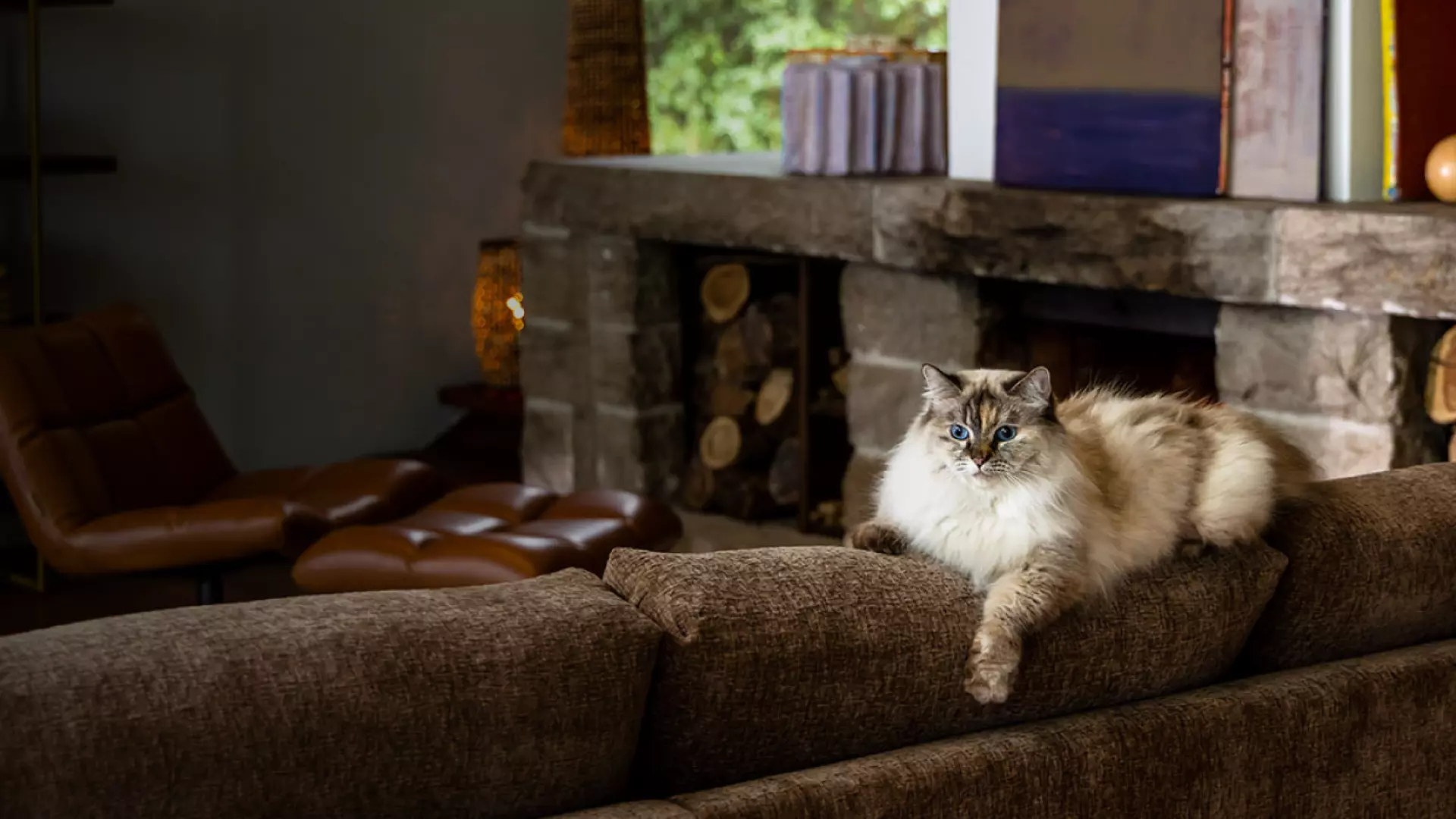
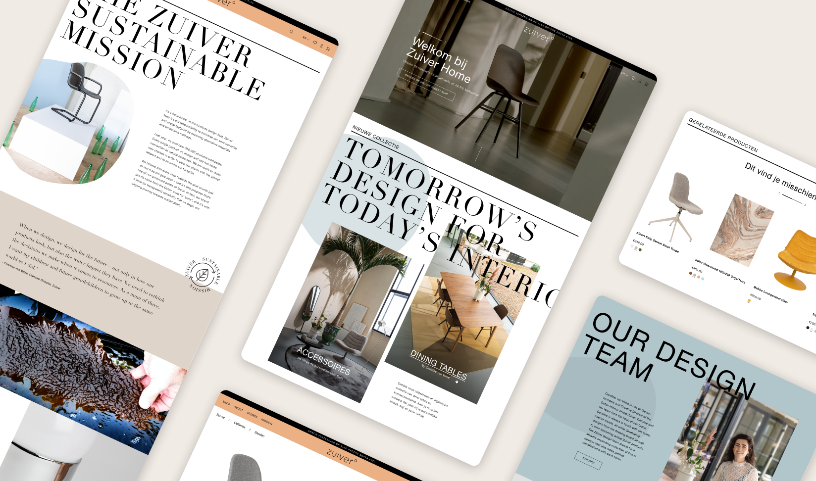
A digital translation of the brand
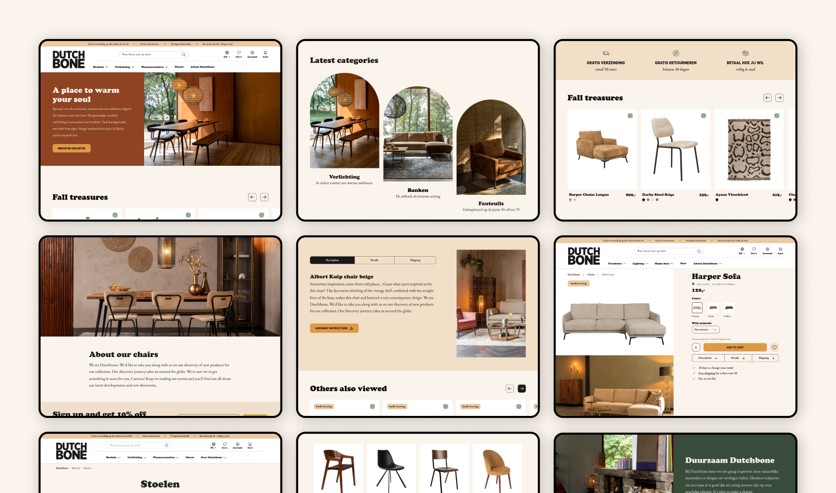
After Dutchbone presented the design directions themselves, our digital consultant and UX designer got to work. The brand story was translated into a digital design with a focus on conversion, which is not entirely unimportant for an online store. Wireframes were used to concentrate on functionality, flow, and content elements to ensure a seamless customer journey. With the wireframes and design direction in hand, the visual design was realized. Dutchbone has a vintage look with a modern twist, nodding to the '50s, '60s, and '70s.
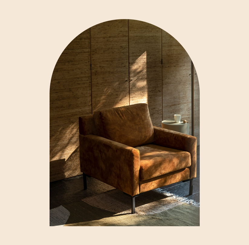
Perfectly imperfect like you would find in nature
Retail is in the detail
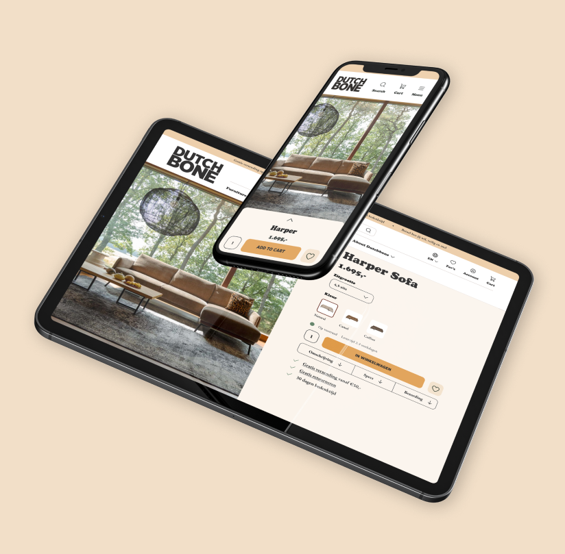
The product page, along with the checkout, is perhaps the most important page of an online store. In Dutchbone's brand story, the emphasis is on visuals, and you can see that reflected well on the product page. Through special layouts, it gives the user the feeling of peeking into people's lives rather than simply looking at a plain product page. The product pages are also designed for mobile in a way that keeps the image prominently displayed instead of being overshadowed by product information.
Chique, that centralized technique
The webshop is built using the lightning-fast Magento Hyvä technology. To take advantage of the scalability of the other two labels, many features have been reused. At the backend, centralization has been prioritized as much as possible. The three labels of Zuiver Group are housed under a single installation, which means one technology, one server, and one order channel. Not only does this save costs, but it is also highly efficient. When items are enriched, it happens simultaneously for all three themes.