Professional yet personal
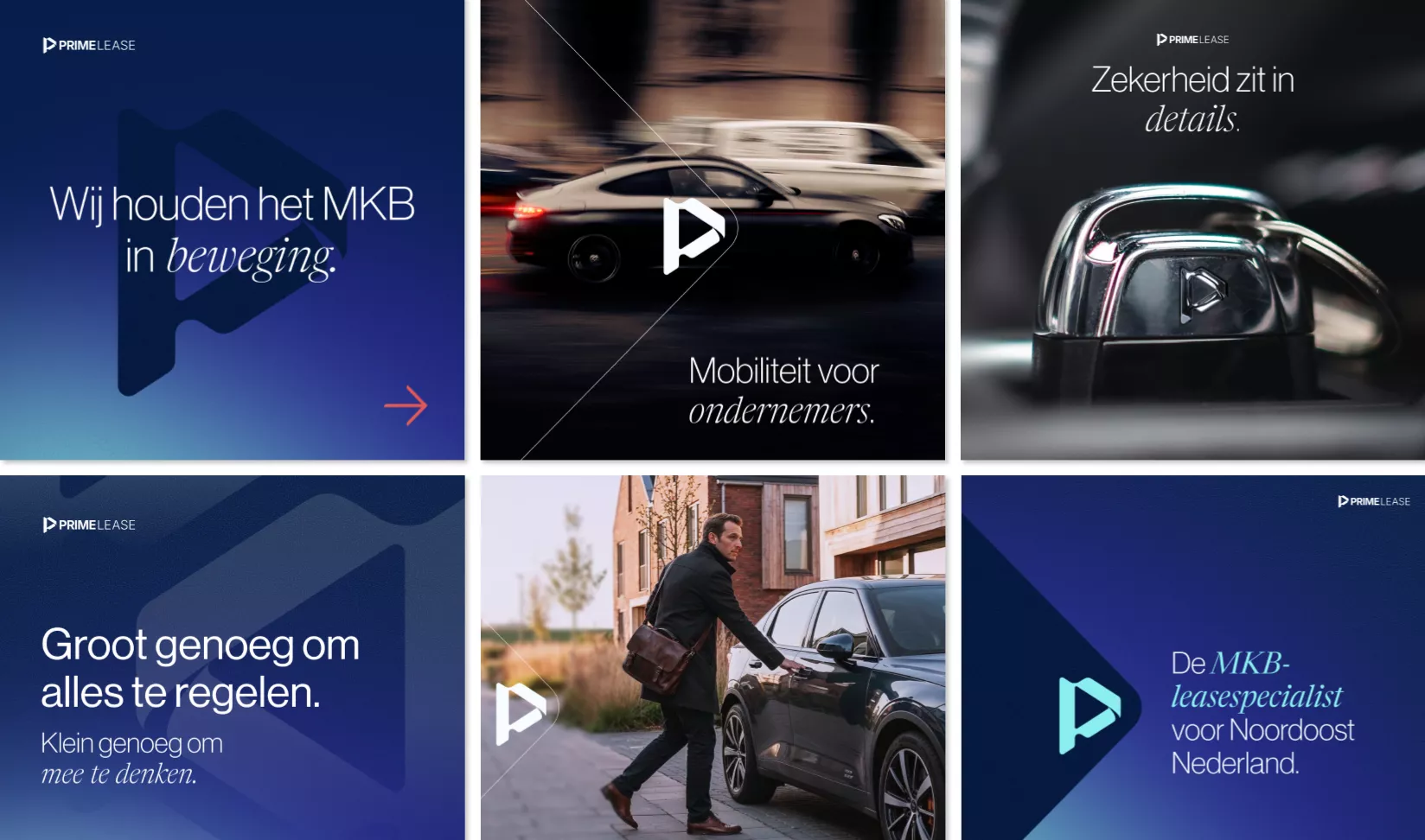
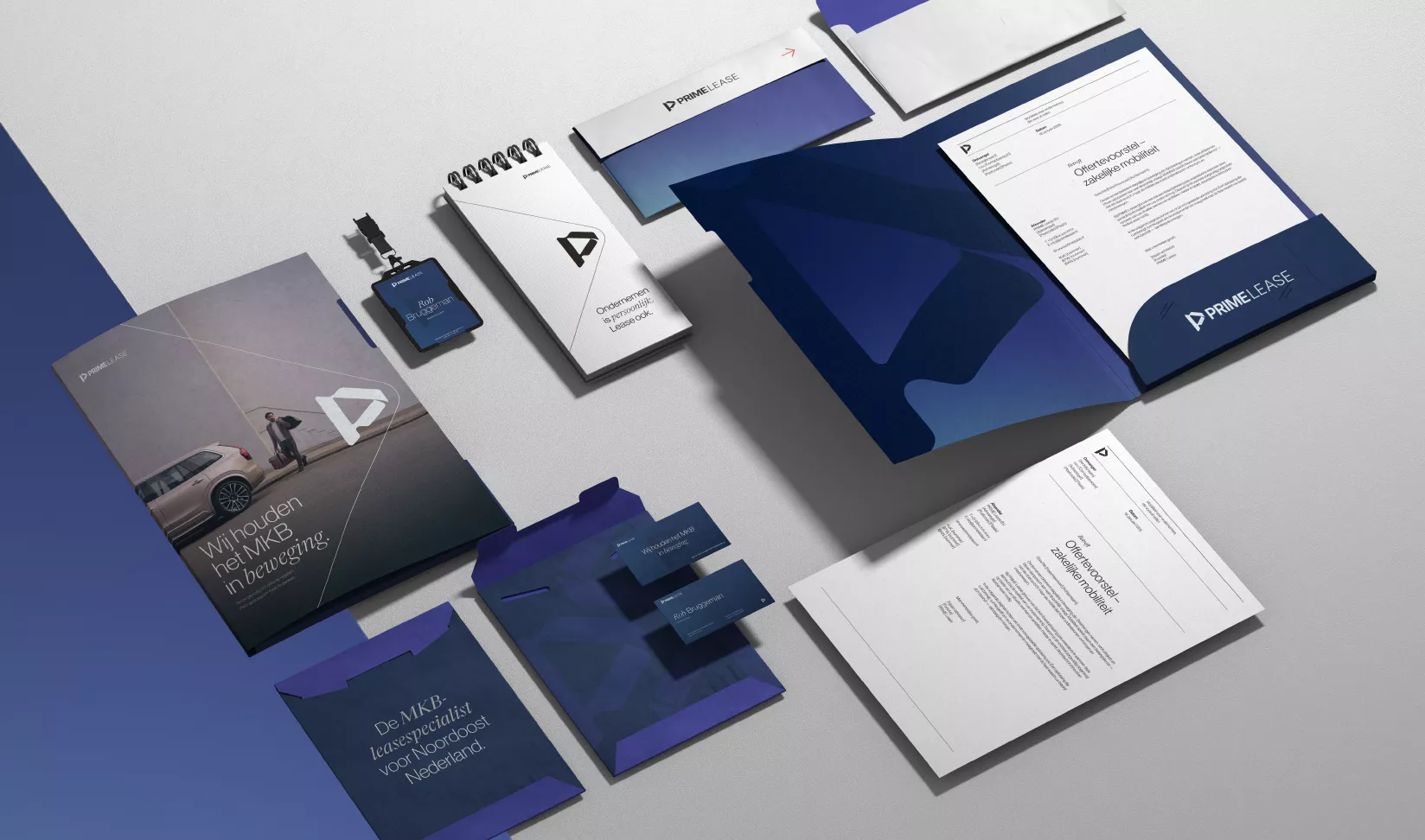
In the typography, we combined a clean, professional foundation with distinct character. This mix underscores our belief that business interactions can also be personal. The color palette strikes a balance between cool professionalism (Deep Blue and Ultramarine) and human warmth (Merlot Maroon and Warm Emberline), complemented by Signal Blue for a modern, fresh twist.
No hassle, just sorted
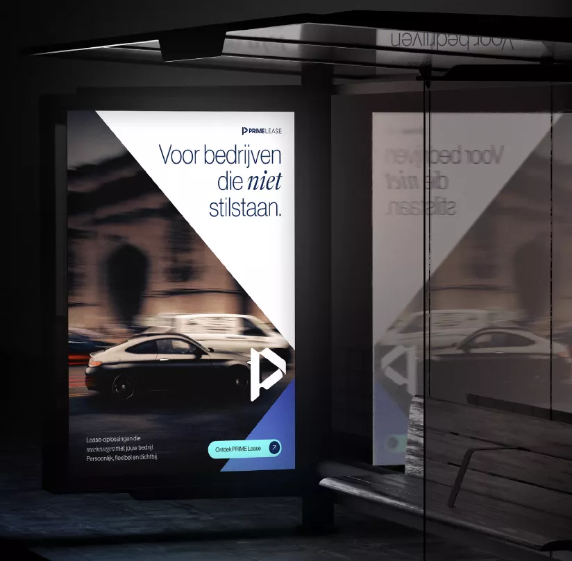
Prima Lease is a partner that thinks along with you and takes responsibility. We translated this ethos into every touchpoint: from an intuitive fleet portal to impactful billboard campaigns and social media carousels that breathe regional, down-to-earth authenticity. The result is a brand big enough to handle everything, yet small enough to truly care.