Netwerk Financieel Gezond MVS
A human-centered brand identity for a financially healthy region.
Our work
Brand strategy
Branding
Seduction
Challenge
Netwerk Financieel Gezond MVS (Maassluis, Vlaardingen, Schiedam) had the ambitious mission of bringing organizations and people together to promote financial health, yet lacked the visual identity to lead that movement. The challenge for Redkiwi? Build an identity from a blank canvas that radiates warmth, humanity, and collaboration without making the subject feel heavy or daunting.
Results
Unity in Identity
A fresh and inclusive brand system that builds instant trust with both residents and professionals.
Accessible Design
A complete visual identity, including a logo, visual language, and icon set, that is 100% WCAG-compliant.
Ready for activation
A brand style guide that empowers NFG to independently manage digital activation, social media, and event communications.
From blank canvas to community brand
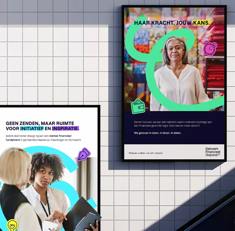
For NFG, we had the opportunity to start from scratch. The platform is there for everyone: from young starters to families looking to stay in control of their finances. We developed an identity centered on a sense of community: a platform for initiative and inspiration. Or, as they put it themselves: “No broadcasting; just room for doing.”
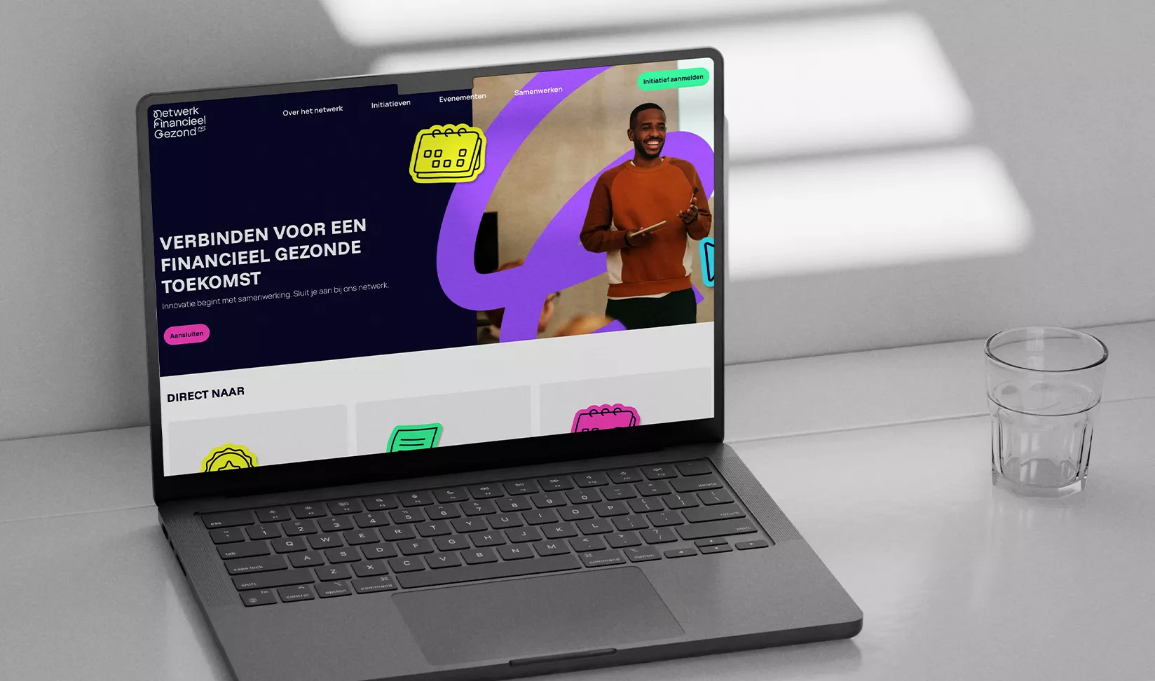
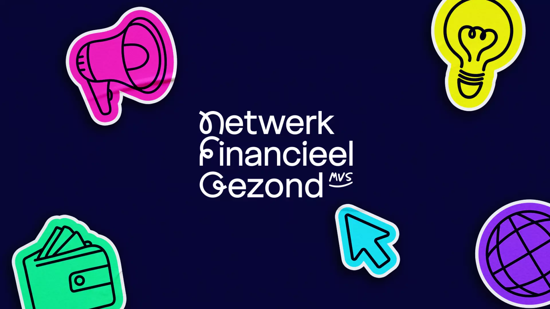
A human face: The marker logo
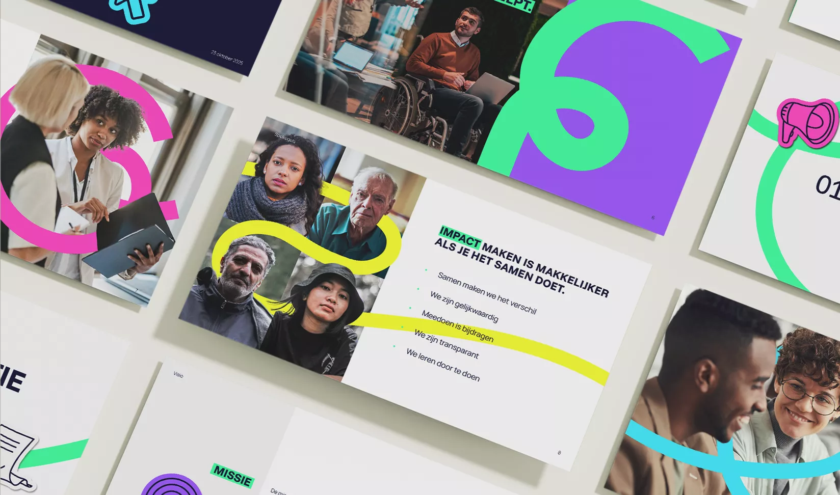
Financial worries can feel heavy; the visual style of NFG conveys exactly the opposite. The handwritten letters N, F, and G are designed in a marker style, symbolizing the spark of ideas and action. The flowing lines are directly derived from the municipal logos of Maassluis, Vlaardingen, and Schiedam, underlining deep regional roots. The addition of a subtle smile in the ‘MVS’ section acts as a positive undercurrent that radiates hope.
A positive undercurrent in color and copy
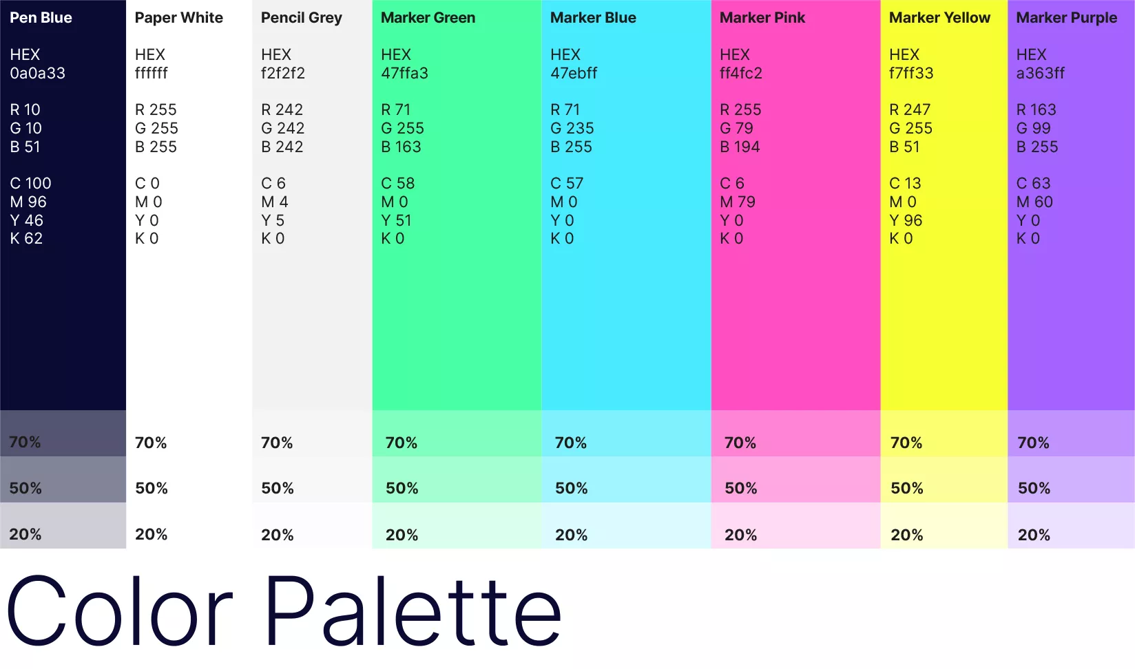
We avoid rigid government jargon and opt for a tone that is activating and human-centered. We chose a color palette with vibrant 'Marker' tones that instantly stand out. By featuring statements with slanted highlight bars—always at a 0.5° angle for that authentic highlighter feel—we visually emphasize what truly matters: connection and movement.
Visual language that connects
The photography is entirely human-centered. By utilizing depth of field, we pull the focus onto real emotions and interaction. We showcase diversity in age and background, using direct eye contact to strengthen the personal connection. To add a playful layer to the visuals, we use illustrative icons that are applied to the imagery like "stickers," fitting the concept of post-its and the sharing of knowledge.
Growth and future
The visual identity was a hit right from the start. Bright, human, and truly connecting. With this solid foundation, NFG is ready to further expand its network and make financial health a topic of conversation across the region. The next step involves more digital activation, from inspiring LinkedIn stories to striking campaign posters. Because making an impact is easier when you do it together.