Redkiwi Blogpost Theory of colour header

The theory behind the use of colour

Examining the most commonly used colours

Branding
Content
Target audience

27.10.2022

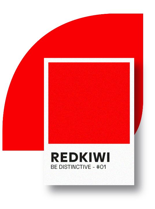
Which colours do you use in your brand's visual identity? Which colours do you use for eye-catching online or offline campaigns? These are important considerations if you want your service or product to make a real impact! When the recipient of your message sees a particular colour, it sends an immediate signal to the brain. After rapidly processing this information, the recipient forms an opinion about what they see. It can pique their interest, but if a colour has an inappropriate meaning, it can also lead to an unpleasant reaction such as boredom.

How to use colour

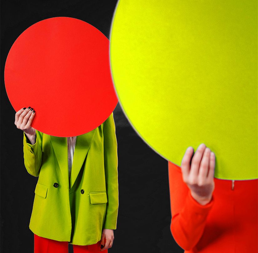
By strategically using certain colours in your communication materials, you guide the recipient's focus exactly where you want it. For example, using complementary colours creates a shock effect on the recipient. On the other hand, using similar colours creates a sense of calm. With that information in mind, colour choice can influence the effectiveness of a campaign, especially when it comes to conversions. Below, we examine five of the most commonly used colours in the advertising world, discussing the associated emotions and characteristics of each colour.

Redkiwi Blogpost The use of colour sticky image
Redkiwi Blogpost Use of colour square image 1

Green for calmness, nature, and health.

Green is versatile. It is a warm, inviting, and soothing colour that gives customers a pleasant feeling. Additionally, it promotes health and unconsciously links to nature and the environment. Even more unconsciously, since green is the 'traditional' colour of banknotes, it often evokes feelings of potential wealth in the target audience. As a brand, you are unconsciously tapping into deep-rooted human desires: success, power, and wealth.

Redkiwi Blogpost Use of colour square image 2

Yellow for attention, happiness, and confidence.

Yellow exudes power and demands the attention of your target audience as a primary colour. Its use conveys a high level of self-assurance, indicating that you know your service or product does what it's supposed to do, delivering on the promises made to the audience. Yellow is also a colour that particularly appeals to young people and radiates happiness, enthusiasm, and creativity.

Purple for elegance and beauty.

Purple is regal and often used by brands with an elegant or prestigious touch. Elegance is the only beauty that never fades. However, you also frequently see the colour purple in beauty-related brands or services.

Blue for credibility and safety.

Blue: the most popular colour among men. If you want to be seen as a credible and cool brand, blue is the perfect choice. The colour is associated with serenity, reliability, intelligence, and a sense of safety. Did you know that it can even stimulate productivity?

Red for power, passion, and urgency.

Red is undoubtedly the colour of power. It grabs attention and holds it well, which is why it is the most prominent colour in marketing. The colour red creates a sense of urgency, making it useful when communicating a promotion or offer. Additionally, the colour stimulates feelings of appetite and physically energizes our bodies. Thus, red is also associated with movement, passion, and excitement.

Effectively persuading every target audience

Want to persuade your target audience more effectively?
If you want to better persuade your target audience, perhaps upgrading your visual identity is the solution. Alternatively, let us brainstorm an eye-catching brand or product campaign for you.

Steven Olde Hengel
Head of Creativity

Curious about our creatieve approach?

Then, please contact us.

CONNECT WITH STEVEN SEND AN EMAIL