Rijnmond
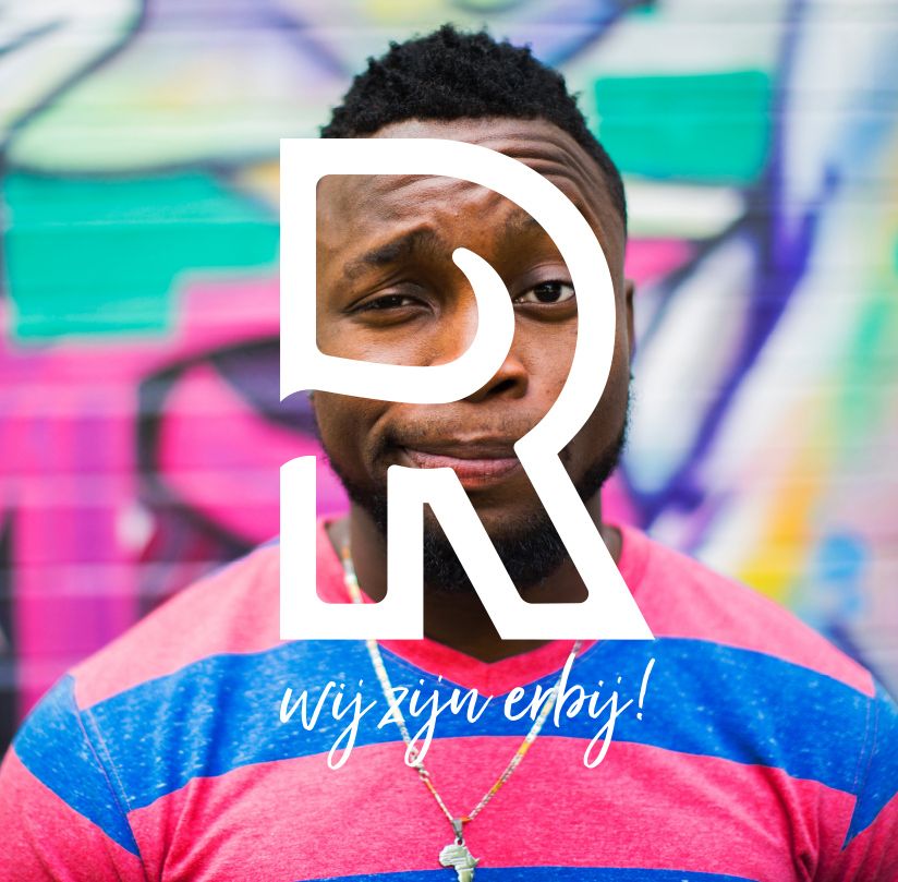
We are there!
Challenge
the province, Rijnmond is the news, current affairs, and emergency channel. Since 1983 on radio via 93.4 FM, and now also available via DAB+ and online radio. On TV since 1997. And of course, always accessible online through the internet and apps for mobile devices.
With the rise of new media, changing consumption behavior, and fierce competition, Rijnmond approached us for a strategic repositioning and upgrade of their visual language. Our challenge was to elevate regional journalism to a higher level and increase the reach on TV, radio, and online channels. After completing the rebranding, we continued with a brand book and a suitable omnichannel campaign.
Results
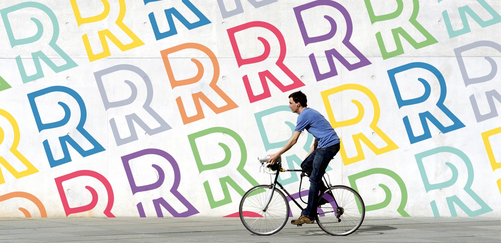
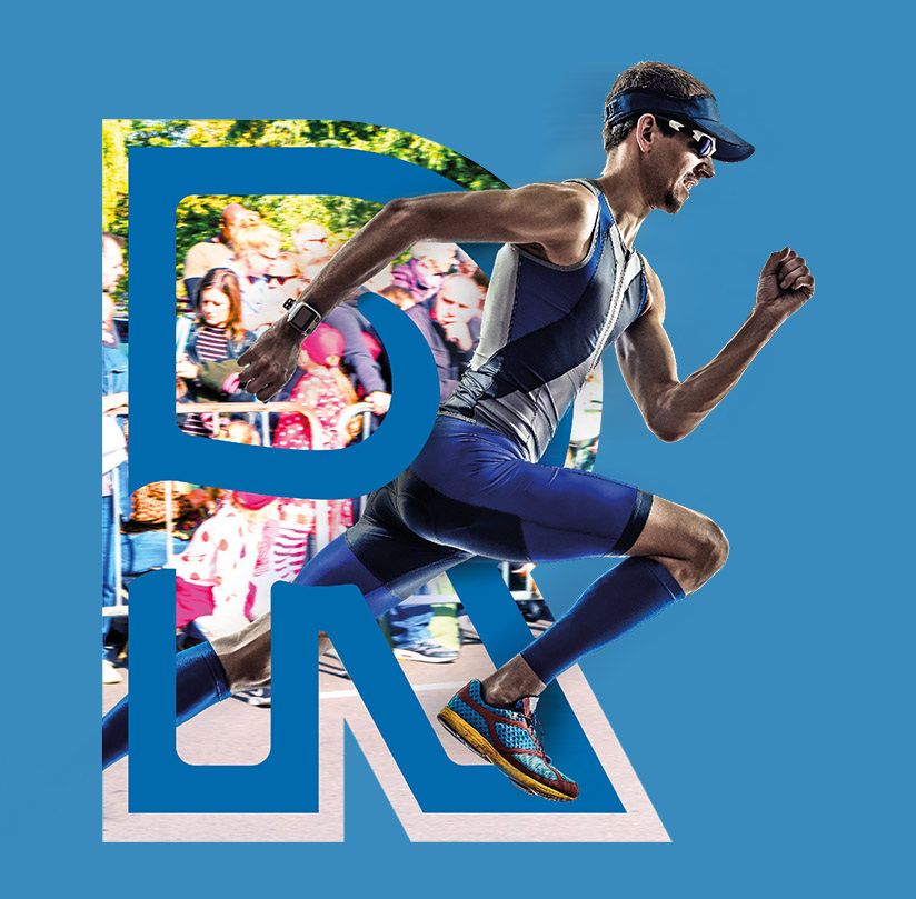
Featuring a recognizable "R" with content as the logo and eye-catching offline materials.
Credible and aligned with the worldviews of the target audience.
Positioning
In the changing media landscape, the task was to safeguard Rijnmond's public mission. We had to be relevant to the target audience with appropriate newsworthy content. Using the Mentality model, we defined the core target groups. By segmenting according to their worldview, we gained insights into what motivates the target groups and how trends emerge. This way, we can better understand their behavior. We conducted a baseline survey to assess the knowledge, attitude, and behavior of each target group towards Rijnmond.
Brand story
With a clear understanding of the desires and concrete needs of the target audience, it was time to communicate Rijnmond's story. An authentic and credible narrative that resonates with the target audience's worldview. A story that genuinely conveys Rijnmond's deep involvement with the region, its people, pride in its history, and its role in the community. Below, we'll take you through the written story.
We are always on.
Accessible and approachable through all our media channels: radio, TV, internet, and mobile. We are informed and deeply embedded in the region with our regional reporters and specialists. That sets us apart from national and international media companies. We keep a close watch on things, report, and raise important issues. We are critical. That's what a public broadcaster does, and that's what people in the region expect from us: independent journalism and reliable information.
Reaching and engaging.
Rijnmond is changing. The region is growing and modernizing, just like the media landscape. That's why Rijnmond is evolving too. Embracing a new era and a new zeitgeist, we see new opportunities. And we are there, with renewed energy and a fresh approach, right in the heart of the community, where things happen! We aim to connect with our audience cross-media, through our radio, TV, internet, and mobile channels. Creating impact with our information and news by involving residents and partners in the region in our stories and reports. Utilizing specific formats to make our information and news engaging and impactful.
Visual language
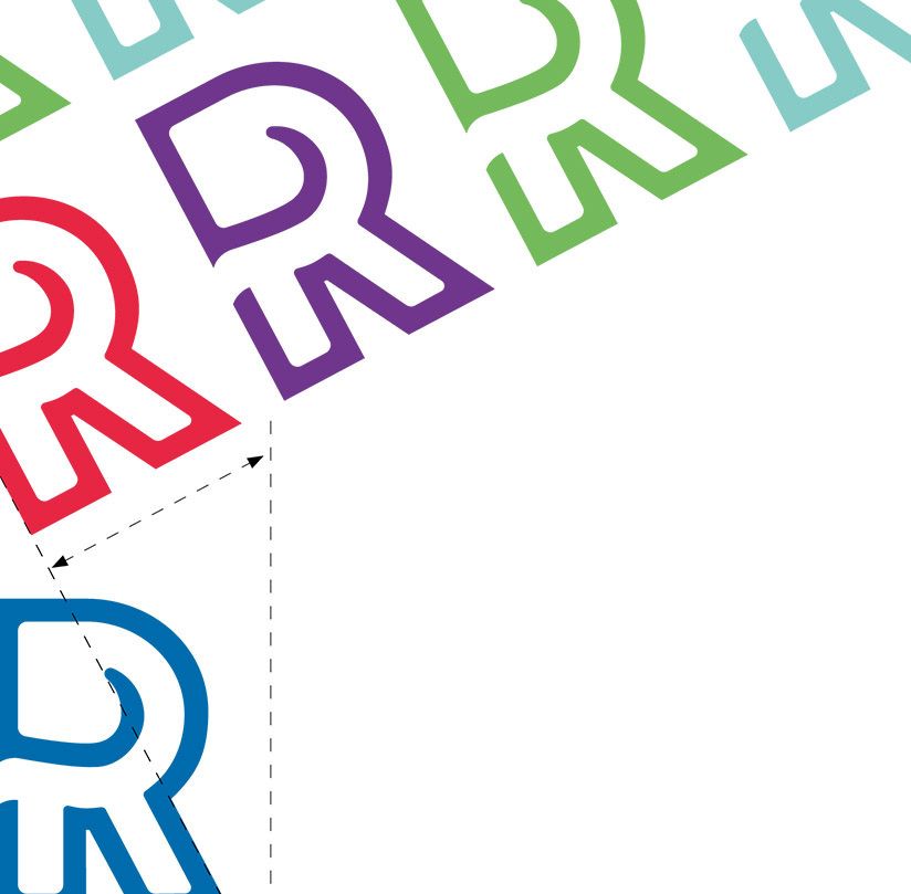
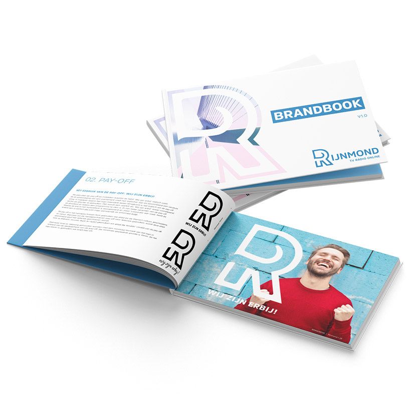
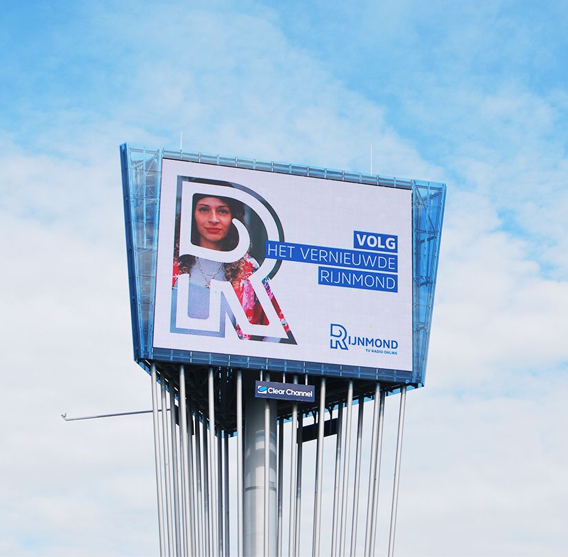
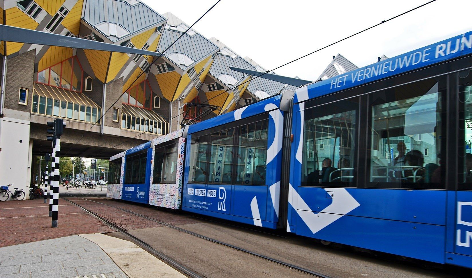
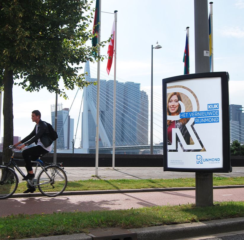
After completing the strategic repositioning, it was time to upgrade the visual language. We started with the logo, the characteristic "R" of Rijnmond. A robust and distinctive letter with enough substance to carry photos and other elements. It's not just a regular R; it's an R that captures the vibrancy of the region. This unique R is so recognizable that it can stand alone without the use of photography or text while still representing Rijnmond. The letter is built from a grid, ensuring that all lines and distances between them are proportionate. This creates visual balance, and these proportions serve as guidelines for developing communication materials.
Brand guidelines
Along with the logo, we also revamped the set of online and offline fonts, the color palette, and other style elements. All these elements were combined into a set of communication grids, suitable for various channels. The complete package, along with an introduction to the strategic positioning, is documented in a brand book or brand guidelines. This serves as the definitive guide for all brand communications. Internally, it serves as a reference point to ensure that all communications are 100% Rijnmond.
Brand assets
With the upgrade of the visual language completed, we provided Rijnmond with a set of stationary assets, including designs for business cards, email signatures, custom keycords, and a PowerPoint template. We extended this visual identity to merchandise as well, including branded coffee mugs, paper bags, and T-shirts.
Campaign
To spread the new positioning and increase brand awareness, we focused on offline communication. We utilized outdoor advertising in the region and visible sponsorship at Rotterdam's most visited and media-covered events, such as the Wereldhavendagen (World Port Days) and the ABN AMRO Open. The redesigned communication materials were visible in the region's streets, and each piece was unmistakably from Rijnmond, thanks to the carefully established guidelines and the recognizable "R" logo. You may have seen the Rijnmond tram pass by or come across our visuals along the Maasboulevard or on the A16.

Want to know more about this case?
Reinoud is your guy! Our CSO will undoubtedly surprise you.
Or would you prefer an agency pitch presentation?
We are also happy to meet in person.

Grow with performance branding
Linkedin says so. Harvard business review and McKinsey too. Performance branding is the future. The winning combination of branding with performance marketing.