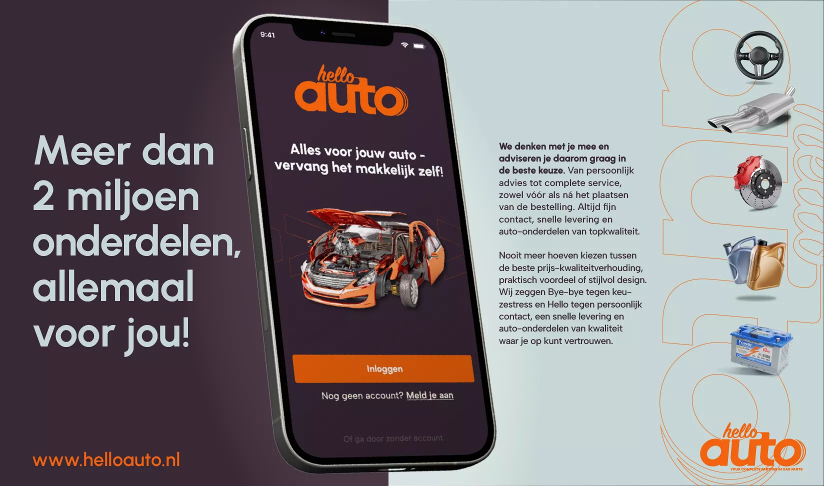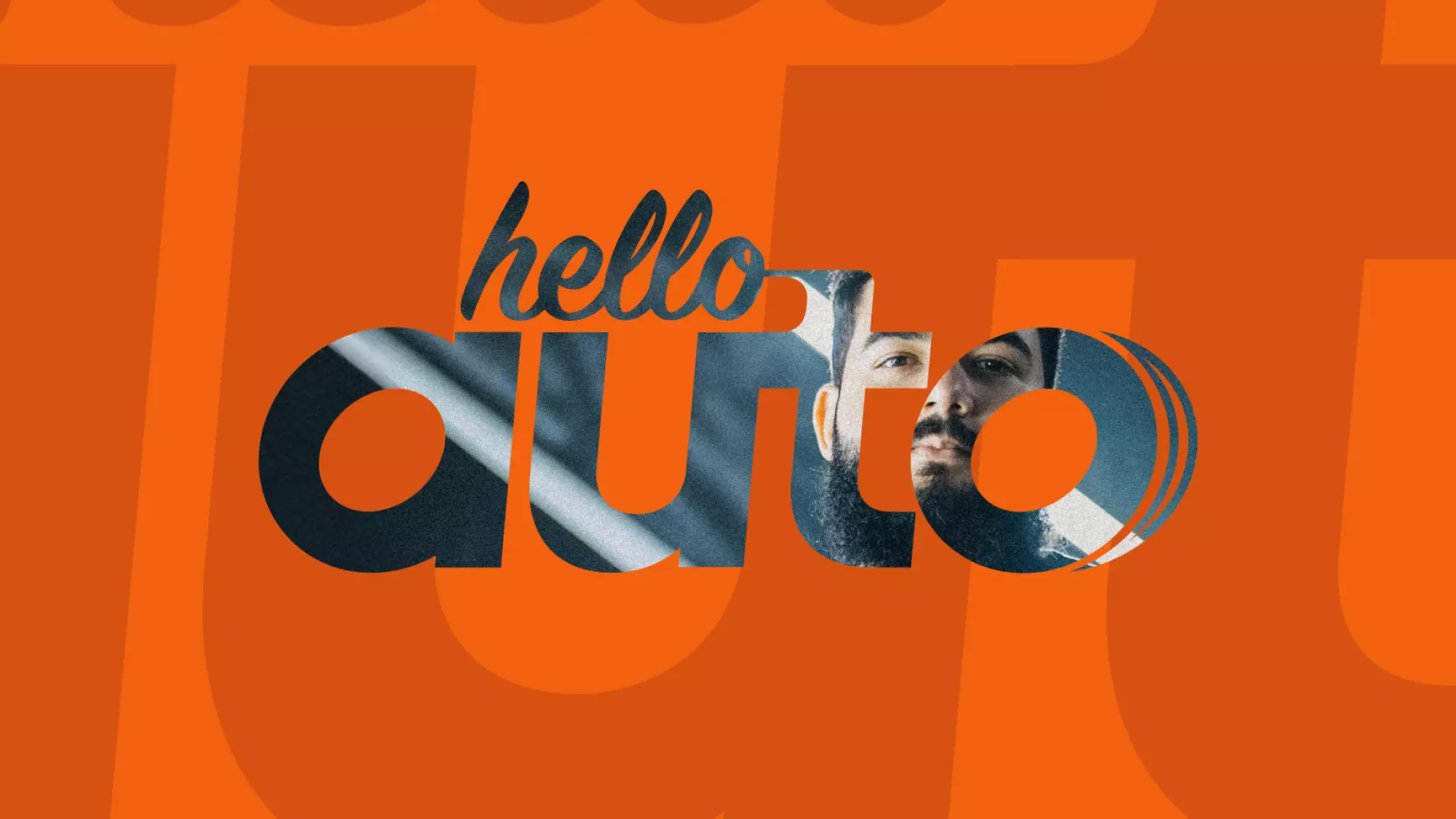
Say ‘Hello’ to speed and playfulness
The heart of the new identity is the logo: a wordmark that combines speed and motion with a human touch. The letter 'O' is subtly shaped like a car tire, creating an instant link to the core business, while the soft, rounded forms evoke a cheerful and inviting atmosphere. It is a 'smashable' logo—one that remains recognizable and powerful even in the smallest app icons.