HalloStroom
Sustainable for everyone
Challenge
From start-up to scale-up. It was the logical step for Dutch energy supplier HalloStroom. This growth required a new, powerful strategic repositioning. Always based on storytelling and neuromarketing. We completed the visual transformation with a completely renewed corporate identity.
Results
Strategic positioning and Visual language.
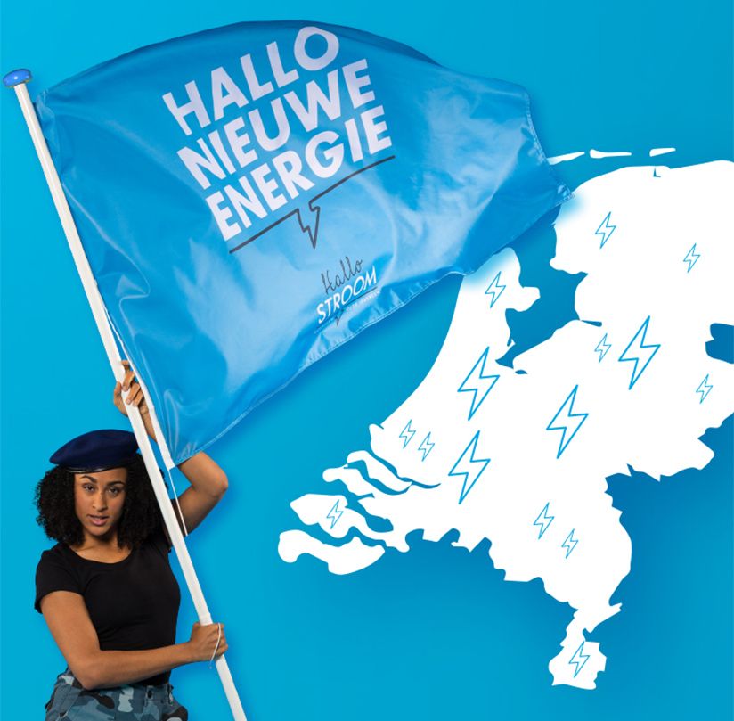
Say hello to the new world
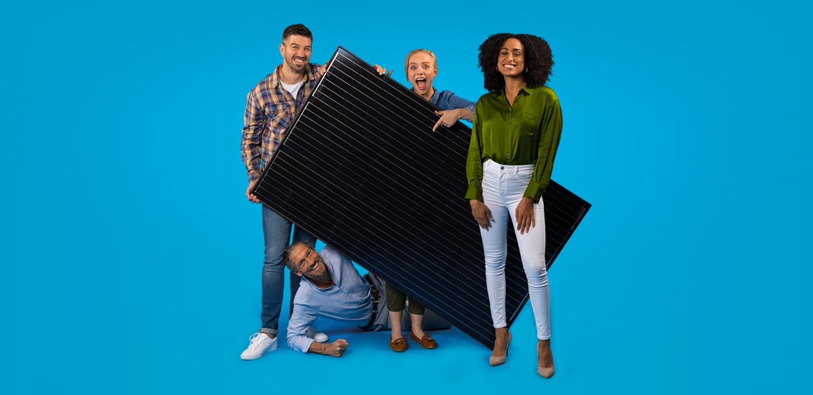
It is 100% sustainable and renewable, without any unpleasant aftertaste. Generated by thousands of households instead of polluting coal plants. And freely shareable with everyone. Our goal is to make this energy accessible. For everyone. That's what we work towards every day.
The sustainable transition accelerates when everyone participates. That's why we offer our systems with simple rental arrangements. So everyone can join without any investment. Don't have your own roof? You can purchase your 100% sustainable energy through our sharing platform from your neighbor or colleague. It's that simple.
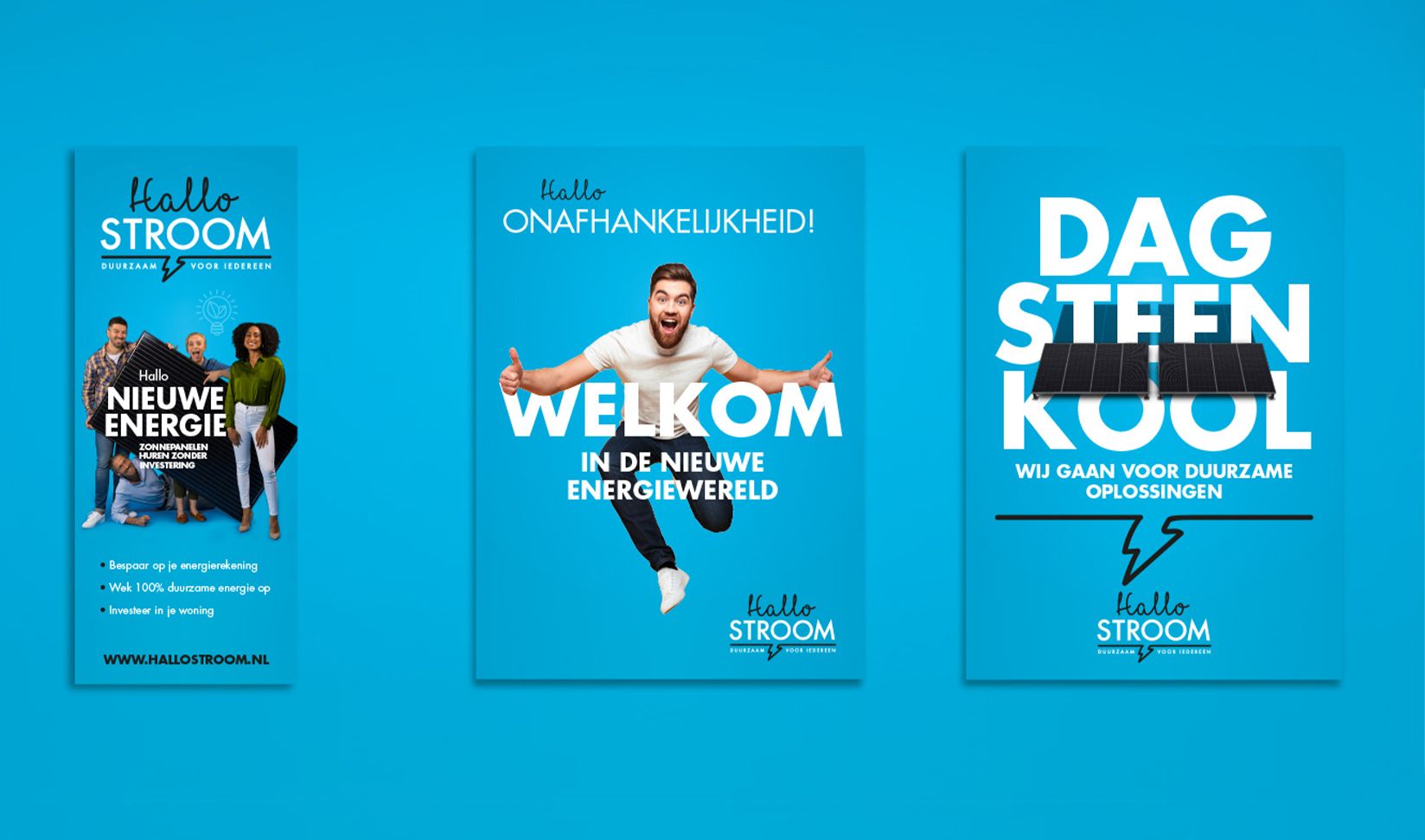
Branding
Based on the strategic repositioning, the new corporate identity was designed. The focus was on conveying a sense of ease and energy. The combination of design elements achieves just that. A clear and strong blend of fonts with a noticeable yet calm color palette. The overall effect is positive, fresh, and modern.

Want to know more about this case?
Reinoud is your guy! Our CSO will undoubtedly surprise you.
Or would you prefer an agency pitch presentation?
We are also happy to meet in person.