
BAR Waste Management
Strategic repositioning and visual identity 2.0
Challenge
The existing logo was perceived as too static and formal, with the name "BAR" visually boxed in. The ambition for the new logo was to express more dynamism, movement, and professionalism. BAR Afvalbeheer needed to inspire, and clearly convey—both in words and imagery—that collaboration with residents is essential. The updated branding had to be more modern, energetic and visually compatible with imagery of its audiences. Everything in motion.
Results
Active and connecting branding that positively influences behaviour and encourages collaboration
A dynamic logo with visual elements that connect and offer versatile application
From static and formal to dynamic and professional
The existing logo was perceived as too static and formal, with the name "BAR" visually boxed in. The ambition for the new logo was to express more dynamism, movement, and professionalism. BAR Afvalbeheer needed to inspire, and clearly convey—both in words and imagery—that collaboration with residents is essential. The updated branding had to be more modern, energetic and visually compatible with imagery of its audiences. Everything in motion.
Towards a life without waste
In reworking the corporate visual identity, our strategists also critically reviewed the existing payoff. From waste to resource: that is the major mindset shift taking place in society. A different view of waste, but also a different approach in behaviour.
BAR Afvalbeheer’s role is that of driver and source of inspiration. To initiate, organise and facilitate everything properly—and to bring both residents and institutions along by positively influencing knowledge, attitude and behaviour. Communication makes that possible.
That’s why the new visual language and payoff also had to be inspiring and fit with the messages that encourage this shift. The new payoff had to spark a shared sense of movement. BAR Afvalbeheer, its partner organisations and residents. Together. And that we are transitioning toward a new world. A different one. A world without waste. Because in the future, ‘waste’ may no longer exist. We’ll speak of reusable resources for new products and applications. We’re moving together towards a life without waste.


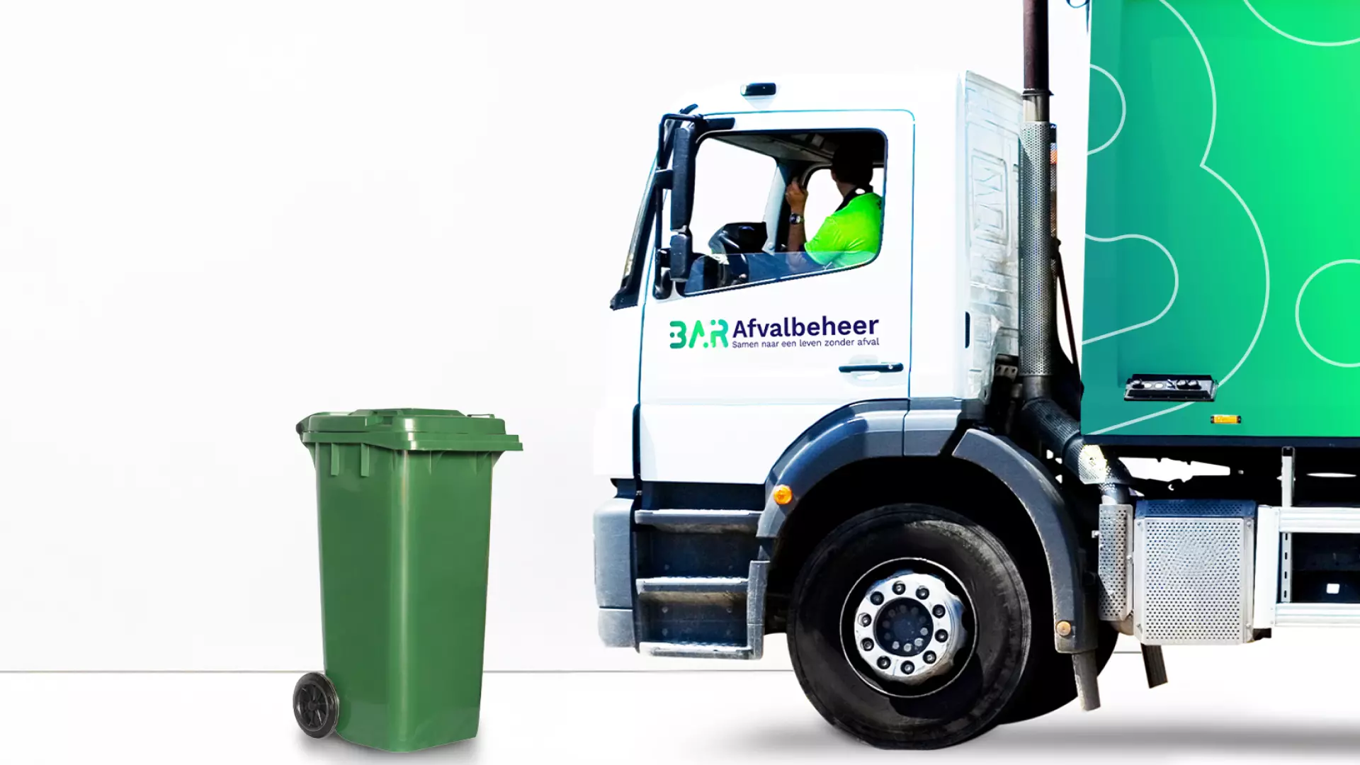
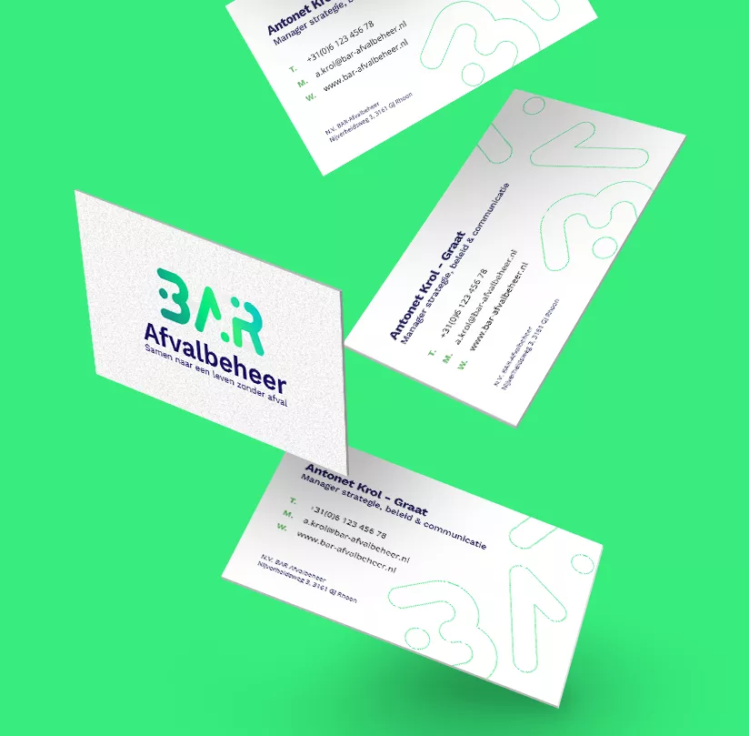
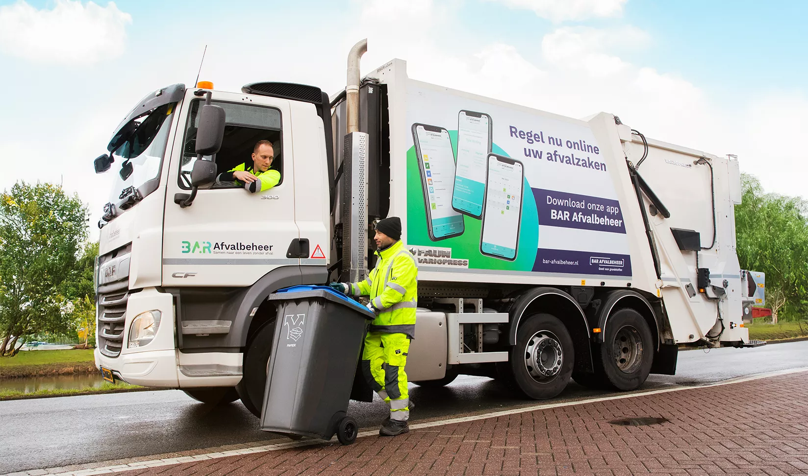
Visual style 2.0: recognisable and widely applicable
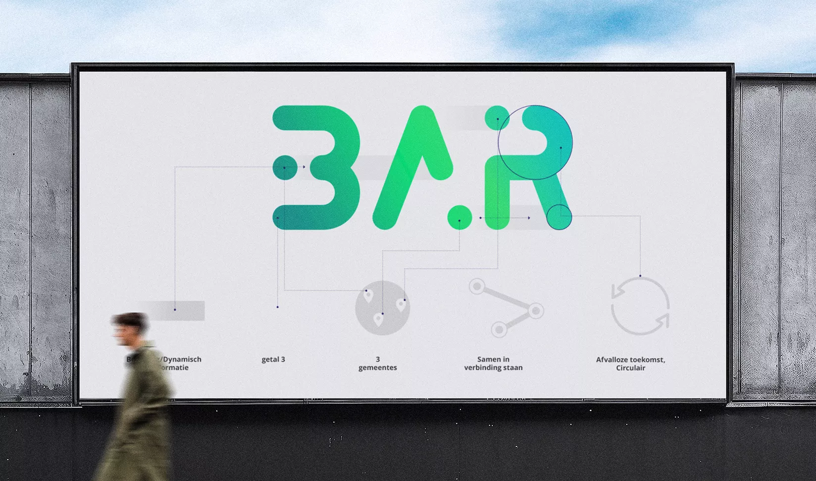
Looking back at the old logo: the name BAR was boxed in like an island, and the colour palette—though professional—lacked inspiration. The brief to our Creative Director was clear: bring more energy, focus on circularity, create something dynamic, and above all, something that connects. Visually highlight the shared effort; together with the residents of Barendrecht, Albrandswaard and Ridderkerk.
This goes beyond just a new logo. The logo is part of the overall identity and inspires the complementary colour palette, typography and design elements.
The updated logo immediately reflects movement, supported by a colour gradient that visualises flow. The three round dots represent the three collaborating municipalities and, as part of the letters in BAR and the horizontal lines, are visually connected.
To make the logo even more dynamic and open, we introduced a "smashable logo" concept. This allows individual elements to be detached and used as visual accents—for example, outlines or image frames.


