
GROOSMAN
Innovative architects, engineers and builders
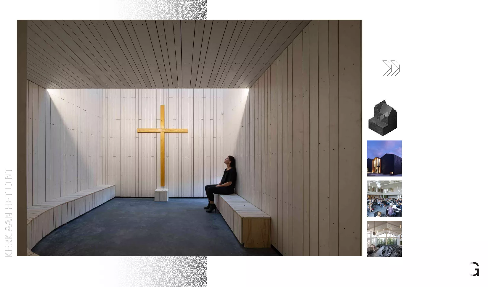
Our work
Brand strategy
Branding
Challenge
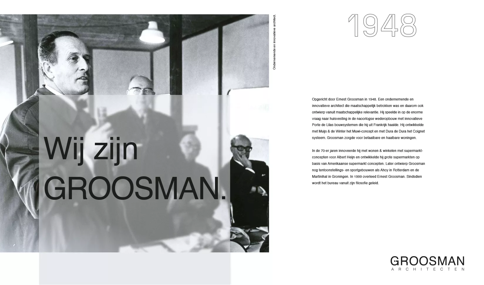
Since 1948, GROOSMAN has been designing, engineering, and realising architectural icons across the Netherlands. Founded by Ernest Groosman - an entrepreneurial and innovative architect with a strong sense of social responsibility - the firm grew during the post-war reconstruction era by developing innovative building systems and delivering affordable, feasible housing solutions. Following Ernest Groosman's passing in 1999, GROOSMAN has continued to be guided by his philosophy.
With three distinct disciplines - architecture, engineering, and construction - and a diverse portfolio spanning various sectors, the company faced challenges in maintaining a clear focus. This presented an excellent opportunity to redefine the organisation's foundational elements through a comprehensive branding trajectory, ensuring a well-grounded path forward for the coming decades. From strategic repositioning to refreshing visual brand assets, Redkiwi eagerly embraced the challenge.
Result
Allround strategic brand positioning
From foundational elements, archetypes, brand story, and core values to mission and vision.
Refined visual language
Perfectly aligned with the renewed brand positioning while retaining elements of the existing visual identity.
Looking ahead to the next 75 years with heritage in mind
A complex question. Following in-depth personal interviews, CSO Reinoud Wolff and brand strategist Laura Šarenac began defining a new foundation for the future. They selected and redefined GROOSMAN’s core building blocks: philosophy, approach, culture, and areas of expertise - brought together in a strategically and commercially concise brand story.
Next, we explored the brand as a personality using Carl Jung’s archetypes - a framework that helps uncover unconscious brand associations and connections. Since 1948, GROOSMAN has operated with a strong sense of social responsibility, making the Caregiver archetype a natural fit. At the same time, their unique architectural vision aligns with the Creator. And because GROOSMAN consistently maintains control over process and cost, the Ruler archetype is equally relevant.
Communicating with conviction and authenticity through a brand story
When you have a lot to say, it can be challenging to stay focused and distil all your messages into one cohesive story. Yet in this case, we succeeded. In just five concise paragraphs, the brand story meets all the key criteria: authenticity, credibility, and clear answers to the questions Why, How and What from GROOSMAN’s perspective. The goal? To inform and positively influence the target audience’s mindset - by using storytelling to tap into their unconscious desires, emotions, and concrete needs.
Everyone aligned through shared core values
Take a close look at how the GROOSMAN team works - and connect that to their philosophy, vision and mission - and you’ve got the perfect foundation for defining shared core values.
These values not only help align the team internally, but are also powerful tools for employer branding. New team members immediately understand what traits and values are needed to truly be a GROOSMAN - or GROOSWOMAN.
GROOS since 1948
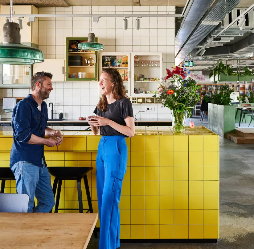
GROOSMAN is committed to creating a healthy and future-proof living environment - where everyone can move, work, care and relax in comfort and at an affordable cost. They work from a place of social responsibility, co-developing with clients in innovative ways, always with a shared focus on health and sustainability. At their core, GROOSMAN stands for curiosity, an entrepreneurial and innovative mindset, and - above all - teamwork. Both within the organisation and in collaboration with clients.
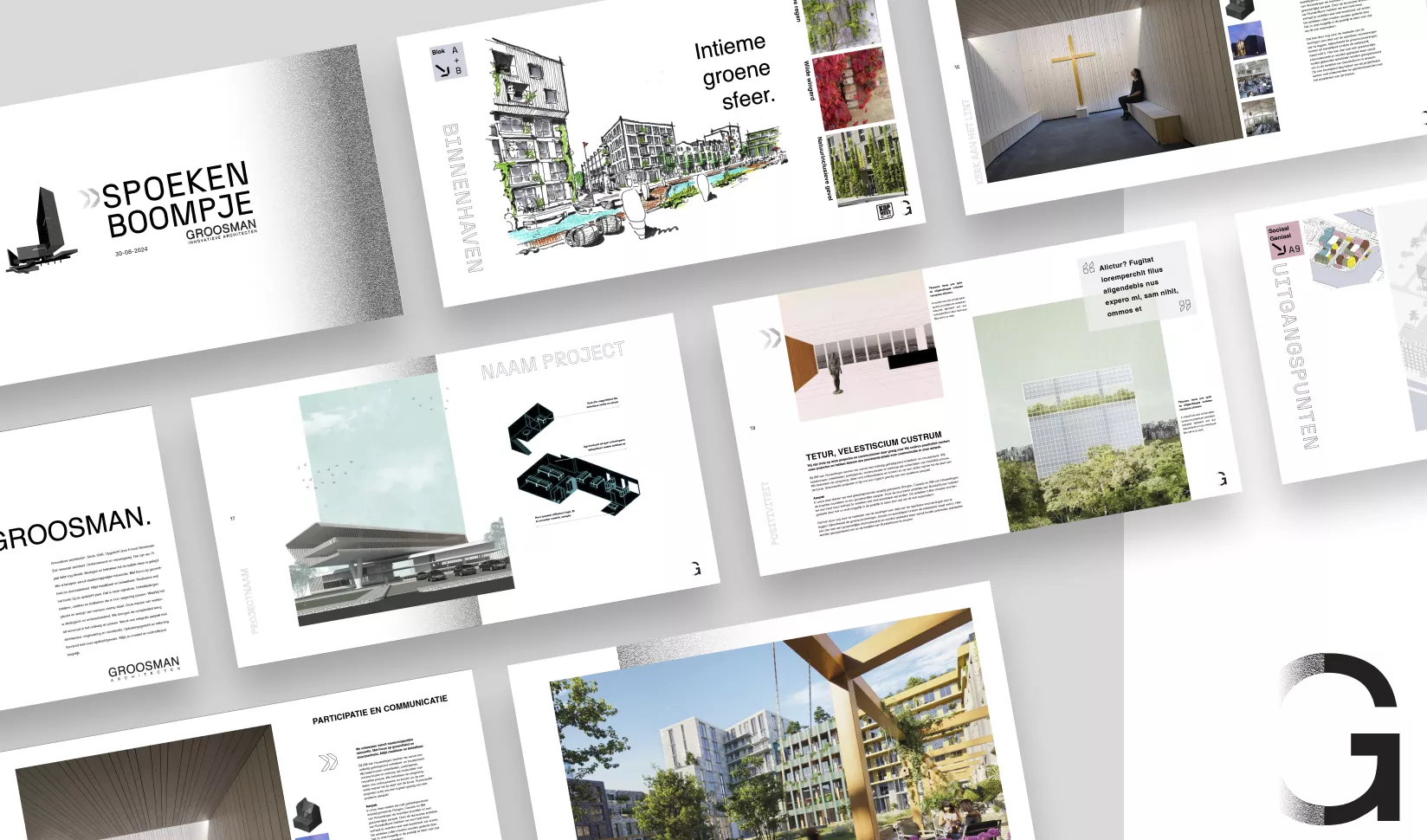
The right visual frame to match the positioning
The goal: a refined visual identity that brings more unity — without losing the recognition that’s been built over time. The new style had to be widely applicable, with flexibility for both projects and overarching themes like people, nature, area development, health and sustainability.
Our Director of Creativity, Steven Olde Hengel, started with four key principles: Unity, Timelessness, Simplicity and Balance. He refined the colour palette, expanded the typography, and introduced graphic elements that add character to the identity and visually support content.

Deep dive into the creative process
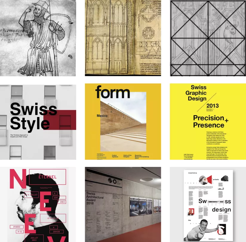
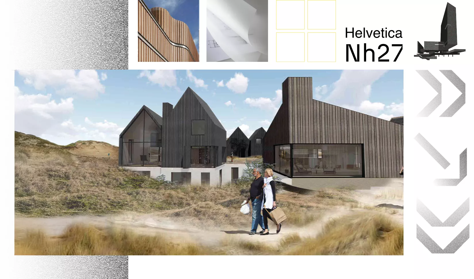
The new visual language emerged from an in-depth exploration of structure, aesthetics and meaning. At its core lies the grid — inspired by Villard de Honnecourt and the Golden Ratio - offering structure without limiting creativity.
Steven drew inspiration from the Swiss school: minimalist, functional, with sans-serif typography (like Helvetica) and generous white space. The result is a visual identity that reflects GROOSMAN’s values: clarity, reliability and genuine involvement.
This visual language isn’t just about aesthetics - it’s a direct translation of GROOSMAN’s design philosophy, right down to the final brick.
Design elements and translation into communication grids
The visual language brings together typography, colour, imagery, iconography and grids into one cohesive whole. Helvetica forms the foundation, while the technical N27 typeface adds accents and icon detail.
The imagery is realistic and theme-based: people, nature, materials and society. Layering, white space and an overlay effect - inspired by tracing paper - subtly reference traditional craftsmanship.
GROOSMAN Yellow remains the signature colour, now complemented by earthy tones like terracotta, sand, green and blue - warm, calm and refined. The grid, influenced by the Golden Ratio, provides both structure and flexibility, ensuring a consistent visual rhythm across all communications.
Ready for strategic repositioning or updating your visual style?
We translate every strategic positioning visually into a distinctive visual language. It's a skill to align the visual language with the story the entrepreneur wants to tell, as it must possess the necessary communication power and flexibility to be applied in various forms. Whether it's videos, advertisements, social posts, or display expressions—a good grid ensures all your expressions are recognisable and have the power to entice the target audience. Because that's ultimately what it's all about. Visual language is about creating expressions that work, that resonate, that move target audiences, and activate behavioural change.