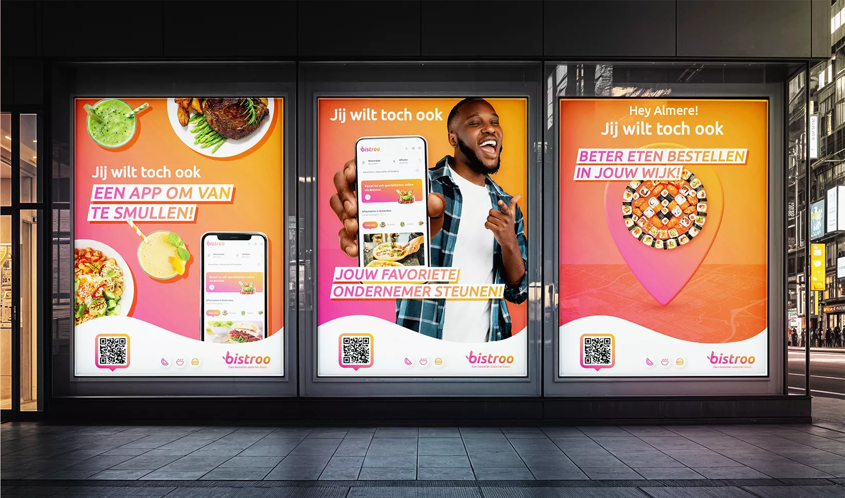
Refinement of visual brand identity
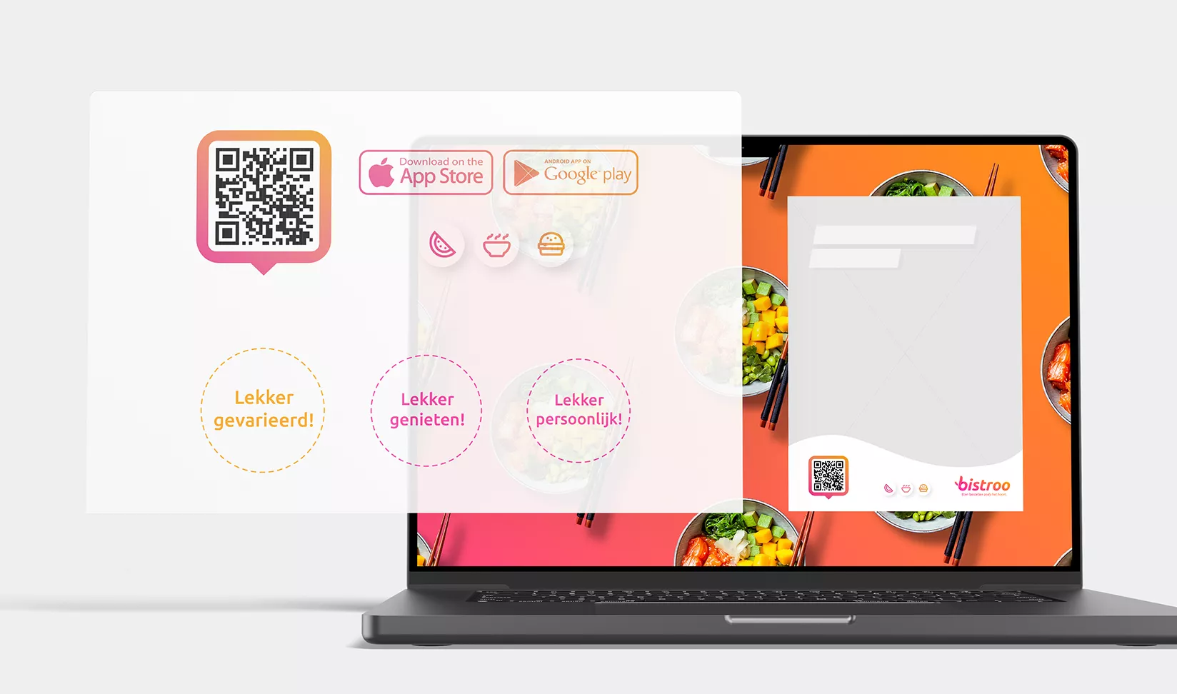
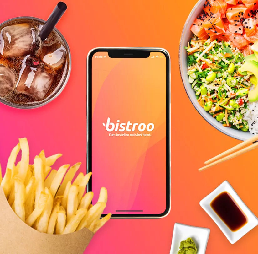
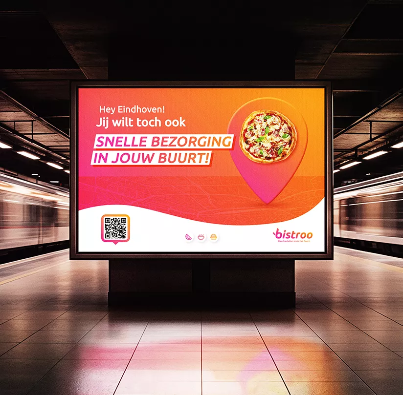
Our concrete task: to develop a refined look and feel that could be rolled out across a regional multichannel campaign, both online and offline. This needed to stay true to Bistroo’s existing brand colours, typography and other graphic elements. We began by defining core creative principles: Freedom, Fairness, Ease, Customer-Friendliness, Personal Touch, and Consciousness. Just as it should be. In line with the values of “Customer-Friendliness” and “Freedom”, we opted for a pink-orange gradient that flows smoothly within the existing colour palette.
We then worked with the Ubuntu font, using it consistently for both headers and body copy. This led to the creation of a striking message bar to communicate key campaign messages. Additional stylistic elements – such as icons and bold circular visuals – were designed to highlight brand values and USPs. All these elements came together in a structured communication grid, with consistent layouts for various formats across on- and offline media.

