Visual style 2.0: recognisable and widely applicable
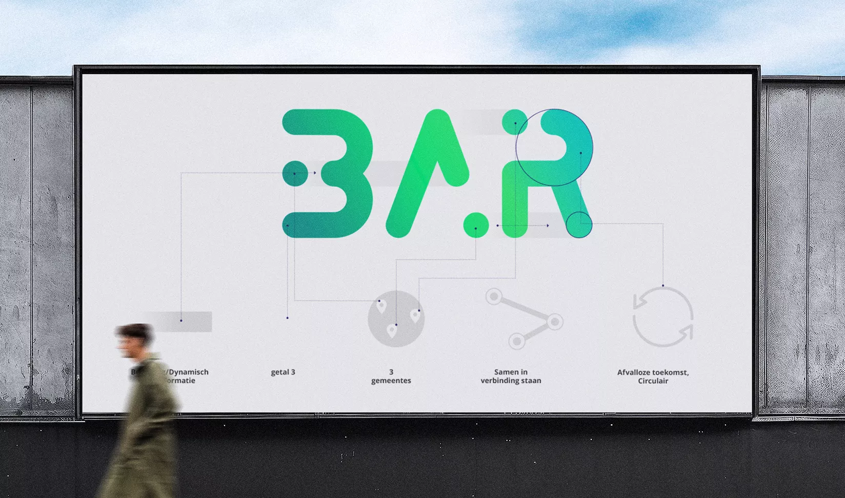
Looking back at the old logo: the name BAR was boxed in like an island, and the colour palette—though professional—lacked inspiration. The brief to our Creative Director was clear: bring more energy, focus on circularity, create something dynamic, and above all, something that connects. Visually highlight the shared effort; together with the residents of Barendrecht, Albrandswaard and Ridderkerk.
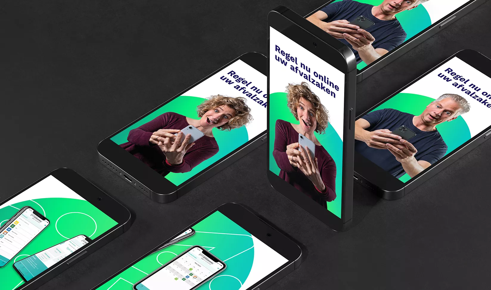
This goes beyond just a new logo. The logo is part of the overall identity and inspires the complementary colour palette, typography and design elements.
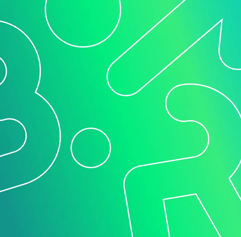
The updated logo immediately reflects movement, supported by a colour gradient that visualises flow. The three round dots represent the three collaborating municipalities and, as part of the letters in BAR and the horizontal lines, are visually connected.
To make the logo even more dynamic and open, we introduced a "smashable logo" concept. This allows individual elements to be detached and used as visual accents—for example, outlines or image frames.
